In this post, we will see how to use TailwindCSS with the Nuxt application efficiently with the help of the official Nuxt module for TailwindCSS. We will also see how to use SVG icons with TailwindCSS instead of images or SVG icons directly and how to build our custom color palettes for TailwinCSS based on a given image.
Table of Content
- Table of Content
- Prerequisites
- Setting up TailwindCSS with Nuxt
- Using SVG Icons with TailwindCSS
- Generate a custom color palette for TailwindCSS
- Summary
Prerequisites
It would be best if you had your Nuxt application set up and ready to go by using the following command:
npx nuxi init tailwind-css-nuxt-demo
Which tailwind-css-nuxt-demo is the name of our code demo application. You can change to any name per your preference.
It would help if you also had a basic understanding of how TailwindCSS and Nuxt.js work to follow this tutorial.
Setting up TailwindCSS with Nuxt
To start using TailwindCSS with Nuxt, you can install and configure TailwindCSS as a dependency following the instructions on the TailwindCSS website. Or you can use the official Nuxt TailwindCSS module following the commands below:
yarn add -d @nuxtjs/tailwindcss
Then add the module to the modules section of nuxt.config.ts:
export default defineNuxtConfig({
  modules: ['@nuxtjs/tailwindcss']
})
You are ready to use TailwindCSS. But before starting to use it, there is additional work we need to perform to ensure TailwindCSS is working smoothly.
Configuring TailwindCSS using tailwind.config.ts
We need to configure TailwindCSS according to our needs. To do so, we create a tailwind.config.ts file in the root of our project (most of the time, it should be at the same level as nuxt.config.ts), with the following code:
module.exports = {
  theme: {},
  variants: {},
  plugins: [],
  purge: {}
}
Let’s look a bit into the properties defined in this file:
theme- where we set up all the projects' additional customized theming, including color palette, font family, breakpoints, border, minimum/maximum sizes, etc. We can overwrite the default theme or extend it using thetheme.extendproperty.variants- where we define an array of responsive and pseudo-class variants for selected core utility plugins such asappearance,borderColor,outlineorzIndex, etc.plugins- a collection of JavaScript functions allowing us to register additional styles programmatically.purge- can be an Array, an Object, or a Boolean value indicating how we want to remove unused styles (or not). The Nuxt module for TailwindCSS automatically adds the needed code to enable purging CSS code during production, followed by a list of files that have reference to any used CSS styles by name, as shown in the example below:
purge: {
    //enable remove unused CSS only in production
    enabled: process.env.NODE_ENV === 'production',
    //any file containing the reference of CSS styles by class name.
    content: [
        'components/**/*.vue',
        'layouts/**/*.vue',
        'pages/**/*.vue',
        'plugins/**/*.js',
        'nuxt.config.js'
      ]
    }
And since our configuration file is in TypeScript, the Nuxt engine won't be able to locate it when running for the application. We need to specify the path to this file in the nuxt.config.ts file by adding the following code to your Nuxt configuration object:
  tailwindcss: {
    configPath: '~/tailwind.config.ts'
  },
Now we have our TailwindCSS configured. Next, we need to load the built-in TailwindCSS styles into our application.
Loading TailwindCSS styles
By default, the Nuxt TailwindCSS module will locate the TailwindCSS styles from ./assets/css/tailwind.css into the application. We can also overwrite this default path using the cssPath property of the tailwindcss configuration object in the Nuxt configuration file.
  tailwindcss: {
    cssPath: '~/styles/tailwind.css'
  },
And in the styles/tailwind.css file, we can import the TailwindCSS class styles using the keyword @tailwind, as follows:
@tailwind base;
@tailwind components;
@tailwind utilities;
In the code above, we import the base, components, and utilities styles, which are:
- The
basestyles are the core styles. - The
componentsstyles are for the components specific. - The
utilitiesstyles are for utilities such as padding, margin, etc.
And that's it. When you run the application, Nuxt will load it with TailwindCSS inside, ready for you to customize the look and feel of your application!
Next, let's see how we can take advantage of TaiwindCSS to build and use icons in applications instead of the classical way of using images or SVG icons directly.
Using SVG Icons with TailwindCSS
Using SVG icons in an application has been a common practice. With the right icon, we can deliver a great user experience to users and make the application more attractive and appealing. But using SVG icons has challenges, such as the effort spent manually creating and saving the SVG files within the application's directory or creating a component to load SVG icons dynamically, etc. Also, choosing the right icon packs to use can be a challenge.
One of my favorite sources of icons is Iconify, made by Egoist, containing a large number of collections of free icons, such as Material Design, Font Awesome, etc., and you can search for icons by name, or by category.
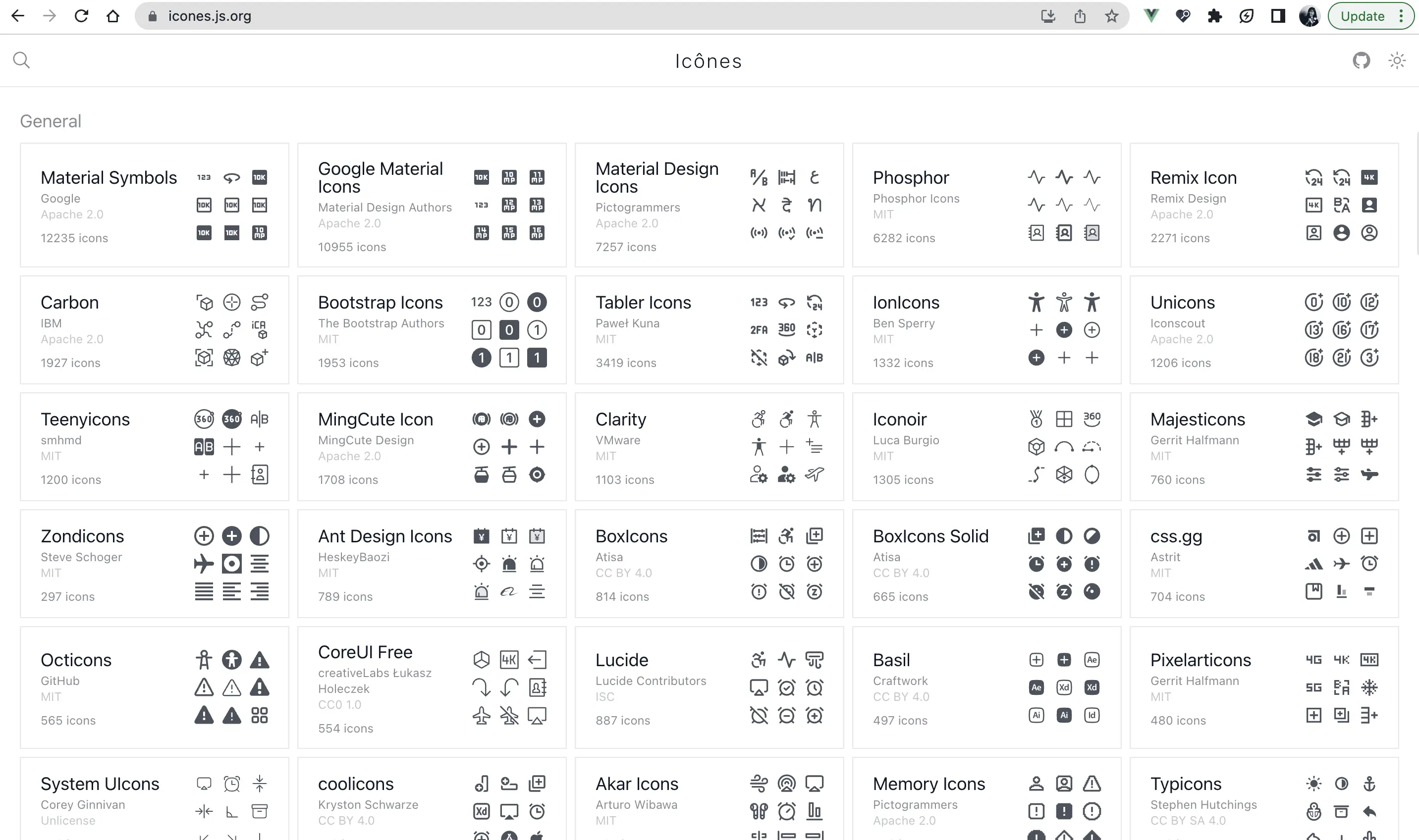
We can choose from various options for each icon displayed on the website, from the Vue component and React component to just a simple SVG file.
You can download the relevant snippet code for the desired icon and copy and paste it into your application. However, this approach can be tedious when your application requires many icons. You can use the tailwindcss-icons package to solve such a problem. This excellent package allows you to load icons from a selected icon pack from Iconify into your TailwindCSS as classes for use in the application.
To start using tailwindcss-icons, we need to install it as a dependency:
yarn add -D @egoist/tailwindcss-icons
The package exposes a method called iconsPlugin to generate an icon pack plugin for TailwindCSS configuration. This method accepts a collection object containing an array of icons packs to use in the application, as follows:
//**tailwindcss.config.ts */
module.exports = {
    plugins: [
        iconsPlugin({
          // Select the icon collections you want to use
          collections:
            {
                // collections of icons
            },
        }),
      ],
}
To generate the collection of icons packs, we can use the method getIconCollections, which accepts an array of icon packs by name, such as the MingCute set, as follows:
plugins: [
    iconsPlugin({
      collections: getIconCollections(["mingcute"]),
    }),
],
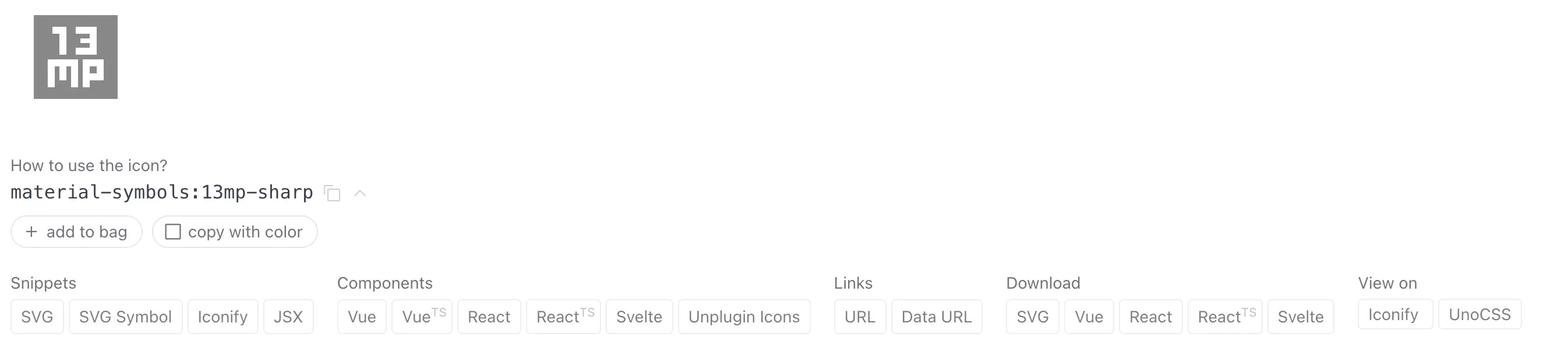
That's all it takes. The package will generate the classes for each icon during compilation, following the pattern i-<collection_name>-<icon_name>. For instance, we want the palette icon from the MingCute set with the name palette-2-line, as shown in the following screenshot:
To do so, we can use the class i-mingcute-palette-2-line on a span element, in orange color and extra large size, as follows:
    <span class="i-mingcute-palette-2-line text-sea-buckthorn-500 text-2xl" aria-hidden="true" />
    <span>Some text</span>
The browser will display our icon as below:

And the best part is that you don't need to manually create and save the SVG files or create a component to load SVG icons dynamically. You need to install and configure the package, and you are ready to go!
Great, right? Let's see how we can build a custom color palette for our application using TailwindCSS.
Generate a custom color palette for TailwindCSS
TailwindCSS comes with a default set of color palettes, but we can also provide our custom color palette using the theme.extend.colors field in the tailwind.config.ts file, as follows:
module.exports = {
  theme: {
    extend: {
      colors: {

      },
    }
  },
}
colors is an object collection in which each key is a color palette name, and each value is an object of key, values where the key is the shade of the color (usually from 50 to 900), and the value is the color code. For instance, the following code defines a color palette named sea-buckthorn, with shades from 50 to 900, and the color code for each shade:
module.exports = {
  theme: {
    extend: {
      colors: {
        'sea-buckthorn': {
            50: '#FEFAF4',
            100: '#FEF6E9',
            200: '#FCE8C8',
            300: '#FBDBA7',
            400: '#F7BF66',
            500: '#F4A424',
            600: '#DC9420',
            700: '#926216',
            800: '#6E4A10',
            900: '#49310B',
        },
      }
    }
);
With the color palette defined, we can use it in our application, following the syntax bg-<color_name>-<shade> for the background color or text-<color_name>-<shade for the text color, such as bg-sea-buckthorn-500 and text-sea-buckthorn-500.
Here comes the real challenge. How can we decide the shades for each color theme? There are many ways to do so, from manually calculating the shadows based on some color theory or using external tools to perform the same task for us.
One such tool is generating color palettes from a given image using Color Palette Generator.
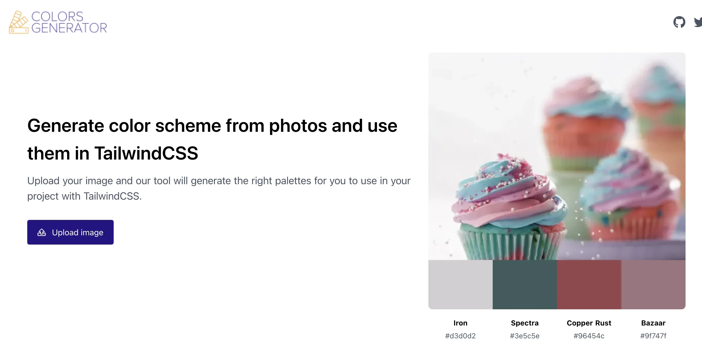
The tool allows us to upload an image, and it will generate the four primary color palettes and their shades in a TailwindCSS format, as shown in the following screenshot:
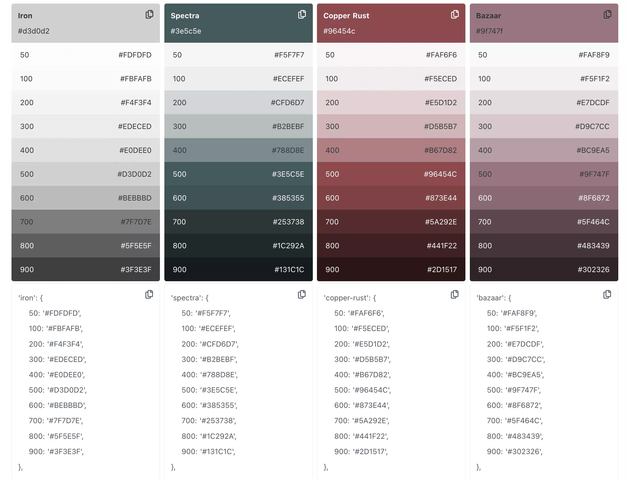
All left is to copy and paste the generated code into your tailwind.config.ts file, and you are ready to use the color palette in your application.
Summary
In this tutorial, we learned how to install and configure TailwindCSS in the Nuxt.js application. We also learned how to inject icons to use as TailwindCSS classes with tailwindcss-icons and how to generate a custom color palette for TailwindCSS fast and easily with an external tool. These certainly are minor aspects of what you can do with TailwindCSS and what it can offer to your Nuxt application. If you have other tips for using TailwindCSS with Nuxt, share them with me in the comment section!
👉 If you'd like to catch up with me sometimes, follow me on Twitter | Facebook.
👉 Learn about Vue with my new book Learning Vue. The early release is available now!
Like this post or find it helpful? Share it 👇🏼 😉
Learning Vue
Learn the core concepts of Vue.js, the modern JavaScript framework for building frontend applications and interfaces from scratch