Build a custom tooltip directive with CSS and Vue

In the previous post, we explored how to build an accessible tooltip component in Vue. However, creating an element for a simple tooltip can be overkill. Hence, in the post, we will explore another approach to enhancing a component with a tooltip, using custom directives and CSS.
Table of Contents
- Table of Contents
- What is a Vue directive?
- Prerequisites
- Creating a tooltip directive
- Registering and using the tooltip in the application
- Adding the tooltip effect with CSS
- Using directive modifiers for the position
- Summary
What is a Vue directive?
While a Vue component is a fully standalone entity of an application, a directive is more like a decorative and lighter-weight block of code that we can attach to an element to enhance its functionality and appearance on the browser. It allows us to directly add side effects or extra modifications to the related DOM elements. Some common examples of a Vue directive are v-if, v-for, etc., which we use extensively in any Vue application.
Besides the built-in directives, Vue also provides us with the Directive API for creating our custom directive. We can define a custom directive as an object of appropriate lifecycle hooks or a function that allows us to interact with the DOM element instance created for the component.
Because our tooltip is mainly about working with classes and CSS and is not likely to change between component updates and mount, we will use the functional approach. Let's get started, shall we?
Prerequisites
You need to have a working Vue application (see the official guide for setting up a new Vue project with Vite) and a basic understanding of CSS, and then we can proceed to create our tooltip directive.
Creating a tooltip directive
To make a custom directive, we first create a new /directives/tooltip.js file in our application source folder with the following code:
export function TooltipDirective(el, binding) {
}
The TooltipDirective function accepts two arguments - the DOM element instance el and a binding object, which contains the value passed to the directive and other modifiers when using it on a component. For our tooltip, we expect the binding.value to be an object with the following properties:
type TooltipOptions{
  text: string;
  position: 'top' | 'bottom' | 'left' | 'right';
}
We can use the binding.value to set the tooltip text and position with the help of classes and the data-tooltip attribute. We also add another class - with-tooltip - on the target element, as follows:
export function TooltipDirective(el, binding) {
    el.setAttribute('data-tooltip', binding.value.text);
    el.classList.add('with-tooltip');

    const position = binding.value.position;
    el.classList.add(`tooltip--${position}`);
}
Upon mounting (and updating) the component, Vue will trigger this function and add a new attribute data-tooltip with the tooltip's content and two additional classes - with-tooltip and tooltip--[position] on generated DOM element, ready for use. But before we can use the tooltip, we need to register our directive within the application. We will do this in the next section.
Registering and using the tooltip in the application
In main.js, we need to import TooltipDirective and register it with the app instance using the app.directive method, as follows:
import { createApp } from 'vue'
import App from './App.vue'
import { TooltipDirective } from './directives/TooltipDirective'

const app = createApp(App)

app.directive('tooltip', TooltipDirective )

app.mount('#app')
Vue will create the relevant directive with a v- prefix. We can now use our tooltip directive in any element with the name v-tooltip as follows:
<button v-tooltip="{ text: 'I am the top tooltip', position: 'top' }">Top</button>
And in the browser, we will see the button element generated with the following HTML:
<button data-tooltip="Im the top tooltip" class="with-tooltip tooltip--top">Top</button>
However, no tooltip will be displayed when hovering or focusing on the element. We need to add some CSS to our tooltip classes, which we will do next.
Adding the tooltip effect with CSS
We add a new assets/tooltip.css file to our application and import it into our main.js file to have it included in our application:
/**main.js */
import './assets/tooltip.css';
In the tooltip.css file, we add the following CSS rules to style our tooltip:
.with-tooltip {
    position: relative;
}

.with-tooltip::before {
    content: attr(data-tooltip);
    opacity: 0;
    position: absolute;
    transition: opacity 2s;
    color: #ffffff;
    text-align: center;
    padding: 5px;
    border-radius: 2px;
    min-width: 120px;
    background: #5e5d5d;
    pointer-events: none;
    z-index: 1;
}

.with-tooltip::after {
    transition: opacity 2s;
    opacity: 0;
    content: "";
    border-width: 5px;
    border-style: solid;
    border-color: #5e5d5d transparent transparent transparent;
    position: absolute;
    z-index: 1;
    pointer-events: none;
}
Here we set the position of the target element to relative to allow the positioning of the tooltip to alignment with it. For the tooltip, we use the ::before pseudo-element to display the tooltip text and the ::after pseudo-element to display the tooltip arrow. We also set some CSS properties to ensure the appearance of the tooltip, such as the following:
opacity: 0to both elements to hide them by default,z-index: 1to ensure the tooltip is always on top of other elements, andpointer-events: noneto ensure the browser won't catch any event, including hover and focus on the::beforeand::afterelements.content: attr(data-tooltip)to set the tooltip text in::beforeto the value of thedata-tooltipattribute using theattr().content: ""to empty the::afterelement.
We also set the opacity: 1 to both elements when the user hovers or focuses on the target element, as follows:
.with-tooltip:hover::before,
.with-tooltip:hover::after,
.with-tooltip:focus::before,
.with-tooltip:focus::after {
    opacity: 1;
}
And finally, we will set the position of the tooltip and the arrow, depending on the position of the tooltip, using the ::before and ::after pseudo-elements of the classes tooltip--top, tooltip--bottom, tooltip--left, and tooltip--right as below:
.tooltip--top::before {
    inset-block-end: 120%;
    inset-inline-start: 50%;
    margin-inline-start: -60px;
}

.tooltip--bottom::before {
    inset-block-start: 120%;
    inset-inline-start: 50%;
    margin-inline-start: -60px;
}

.tooltip--left::before {
    inset-block-end: 0%;
    inset-inline-end: 120%;
    min-height: 100%;
}

.tooltip--right::before {
    inset-block-end: 0%;
    inset-inline-start: 120%;
    min-height: 100%;
}

.tooltip--left::after {
    inset-block-start: 25%;
    inset-inline-start: -20%;
    border-color: transparent transparent transparent #5e5d5d;
}

.tooltip--right::after {
    inset-block-start: 25%;
    inset-inline-end: -20%;
    border-color: transparent #5e5d5d transparent transparent;
}

.tooltip--top::after {
    inset-block-start: -20%;
    inset-inline-start: 40%;
    border-color: #5e5d5d transparent transparent  transparent;
}

.tooltip--bottom::after {
    inset-block-end: -20%;
    inset-inline-start: 40%;
    border-color: transparent transparent #5e5d5d transparent;
}
Note we use inset-block and inset-inline CSS logical properties to align the tooltip and the arrow with the target element. Refer to the previous tutorial to learn more about logical properties and how we create the arrow tip.
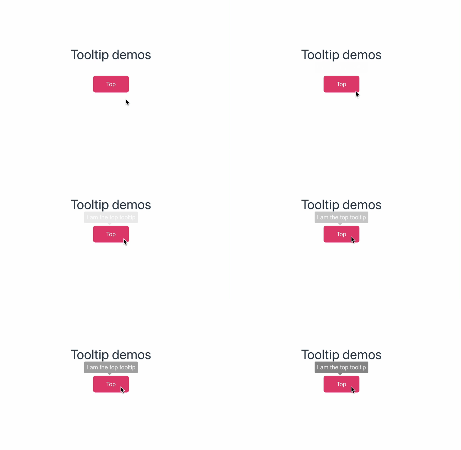
Our button element will now have a tooltip when hovering or focusing on it, as seen in the below screenshot:

Straightforward enough. We can now play around with the tooltip's position by changing the position property of the value passed to the directive. However, it can be tedious to write the position property every time we use the directive. To make it cleaner and more organized, we can use the directive modifiers, and we will see how to do that next.
Using directive modifiers for the position
We can define the position as the directive's modifiers, denoting with the syntax v-tooltip.[position], like in the following example:
<button v-tooltip.top="'I am the top tooltip'">Top</button>
Vue will convert the modifiers into a binding.modifiers object, where each property is the name of the modifier, and its value is true. In the above example, the modifiers object will be { top: true }.
In our TooltipDirective.js, we can implement a function to return the suitable position class based on the binding.modifiers object, as follows:
function getPositionClass(modifiers) {
    if (modifiers.top) {
        return 'top';
    } else if (modifiers.bottom) {
        return 'bottom';
    } else if (modifiers.left) {
        return 'left';
    } else if (modifiers.right) {
        return 'right';
    }

    return 'top';
}
And we can refactor TooltipDirective.js to use the getPositionClass() function like in the following code:
  el.setAttribute("data-tooltip", binding.value?.text || binding.value);
  el.classList.add("with-tooltip");

  const position = binding.value.position || getPositionClass(binding.modifiers);
  el.classList.add(`tooltip--${position}`);
Note that we now get the text value from both binding.value.text and binding.value to allow the user to pass the text value as an object or a string.
That's it. We can use our tooltip directive in favor of the modifiers, as in the below example:
    <button v-tooltip.top="'I am the top tooltip'">Top</button>
    <button v-tooltip.bottom="'I am the bottom tooltip'">Bottom</button>
    <button v-tooltip.right="'I am the right tooltip'">Right</button>
    <button v-tooltip.left="'I am the left tooltip'">Left</button>
And the result will be as same as the previous approach of creating a tooltip as a component:

How about accessibility? It comes for free with our directive, without the need for aria-describedby or role:tooltip attributes since the tooltip text is on the same element. Since we place it on the ::before pseudo-element, the screen reader will be able to read in the following order: tooltip text, the target element text, and the target element's role. Isn't it awesome?
Summary
A custom directive is a great feature to create reusable add-ons at the low level when using components can be overkill. Also, by using the proper CSS element selector, we can add extra UI functionality, like a text tooltip for an element, with less code.
However, using the tooltip component approach can be an advantage for more complex scenarios where you want to display a tooltip with more than just text, like a paragraph or an image with some extra stylings. In such cases, I suggest combining both approaches, directive for simple tooltips and component for more complex ones.
👉 If you'd like to catch up with me sometimes, follow me on Twitter | Facebook.
👉 Learn about Vue with my new book Learning Vue. The early release is available now!
Like this post or find it helpful? Share it 👇🏼 😉
Learning Vue
Learn the core concepts of Vue.js, the modern JavaScript framework for building frontend applications and interfaces from scratch
