Build an accessible tooltip component efficiently with CSS and Vue
Tooltip is an informative and short message which appears only when there is user interaction with an element on the UI of an application. As a commonly used feature, it aims to provide hints or additional descriptive information for a particular part. For interactive elements like buttons, especially icon buttons, using a tooltip improves the component's visual accessibility and user experience on both keyboard and mouse navigation. While title only appears on mouse hovering, a tooltip is a great solution for providing crucial information about the element on keyboard focusing.
There are two ways to create a tooltip for a specific element in Vue: as a wrapper component with a slot or as a custom directive on the target component.
This article will explore the first approach - building a tooltip component using Vue and CSS. And yes, you don't need a component library for tooltips, as it will only take a few lines of code.
Table of Contents
- Table of Contents
- Prerequisites
- Building a
Tooltipcomponent with a slot - Position the tooltip with CSS and props
- Adding an arrow to the tooltip with pseudo-element
::after - Announce the tooltip content to screen readers
- Resources
- Summary
Prerequisites
You need to have a working Vue application (see the official guide for setting up a new Vue project with Vite) and a basic understanding of Vue and CSS.
Once your Vue project is ready, we can create our tooltip component.
Building a Tooltip component with a slot
Our Tooltip contains a wrapper element that includes the following child elements:
- Any child component injected through a default
slot - A text field acts as the tooltip for the injected component. The component receives the content for this text field to display using
textprops.
Based on these requirements, we will add the following code to our Tooltip.vue file:
<template>
    <div class="tooltip-wrapper">
        <slot />
        <span class="tooltip__text">{{ text }}</span>
    </div>
</template>
<script>
const props = defineProps({
    text: {
        type: String,
        required: true
    }
})
</script>
In the above code, we use a div with the class tooltip-wrapper as the wrapper element for:
- A default
slotas a component placeholder, - A
spanelement that displays thetextvalue for the tooltip and has the class nametooltip__text.
And within the <script>, we define the text props as a required string using the defineProps method.
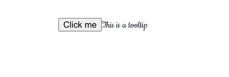
Great. We now have the essential structure implemented for our tooltip component. We can then import and use Tooltip in any Vue component as follows:
<template>
    <Tooltip text="This is a tooltip">
        <button>Click me</button>
    </Tooltip>
</template>
<script setup>
import Tooltip from './Tooltip.vue'
</script>
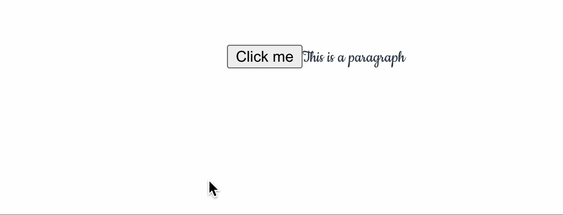
However, Tooltip at this point is not functional and will always display the tooltip next the target element, as in the below screenshot:
To make the component fully functional, we need to add the CSS stylings and control the tooltip's position and visibility, which we will explore in the next section.
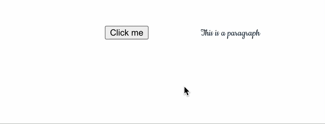
Showing the tooltip on hover with CSS
By default, the tooltip should be invisible on the UI when there is no interaction with the element. To do so, we set visibility to hidden and opacity to 0 for the .tooltip__text class, and add a transition effect for a smooth transition on opacity. We will also add other CSS properties to provide a nice layout for the tooltip and set the wrapper element (.tooltip-wrapper) with display: inline-block to have the same width as its nested element, as shown in the below code:
.tooltip__text {
    visibility: hidden;
    opacity: 0;
    transition: opacity 1s;

    color: #ffffff;
    text-align: center;
    padding: 5px 0;
    border-radius: 2px;
    min-width: 120px;
    background: #5e5d5d;
}

.tooltip-wrapper {
    display: inline-block;
}
We want to show the tooltip when the user hovers over the target element. We can do this by changing the value of the opacity property to 1 and visibility to visible, for the class .tooltip__text when .tooltip-wrapper is on :hover, like in the below code:
.tooltip-wrapper:hover .tooltip__text{
    visibility: visible;
    opacity: 1;
}
You can see how the tooltip is visible with a smooth transition effect when the user hovers on the target element in the below screenshot:
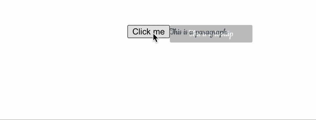
Because we place the tooltip below the target button element, it will leave a space when not visible, causing a potential UI bug. We can avoid this issue by using the position: absolute to remove the tooltip from the usual flows of the page layout, hence removing the space generated with it. We also need to set the z-index to 1 to ensure the tooltip always overlaps on top of other elements when visible.
.tooltip__text {
    /**... */
    position: absolute;
    z-index: 1;
}
And we must set the position: relative for the .tooltip-wrapper to make sure to position the tooltip relative to the wrapper element, as follows:
.tooltip-wrapper {
    position: relative;
    display: inline-block;
}
Now the browser will display the tooltip correctly next the target element, as in the following screenshot:
We have successfully created a tooltip component showing the tooltip on hover. However, if you navigate the page using the keyboard, you will notice that the tooltip is not visible when focusing on the target element with the Tab key. Thus, it will cause a visual accessibility issue for scenarios where the target element has no other descriptive label than the tooltip. Adding the :focus pseudo-element to the .tooltip-wrapper selector will not help since the focused element here is the target element - button, and not its parent - the div. Also, Vue doesn't support automatically passing attributes like class from the slot to the target component, making it harder to compose the correct CSS selector.
In such a scenario, we use the ::slotted() pseudo-element, which we will discuss next.
Showing the tooltip on focus with pseudo-element :slotted()
The :slotted() pseudo-element is a CSS selector that allows us to select elements passed into a component's default slot. It accepts a simple component selector (without space) as its argument. For our case, we can select our target element(s) using the selector *, thus :slotted(*).
:slotted(*) {
}
We can then add the :focus pseudo-element to the :slotted(*) selector and use the adjacent sibling combinator (+) to select the immediate sibling of the target element, which is .tooltip__text, and change its opacity to show the tooltip, as in the following code:
:slotted(*):focus + .tooltip__text {
    visibility: visible;
    opacity: 1;
}
Note here * will work without worrying about the nested elements inside the target one because :slotted() can only select the first-level children of the slot.
And now when focusing on the target button element using the keyboard navigation, we can see the tooltip visible as expected:
We now have a fully functional tooltip component that shows the tooltip on hover and focus. Nevertheless, the browser will always display the tooltip below the target element, which is not so customizable. The following section will explore how to position the tooltip using props and the target element's position.
Position the tooltip with CSS and props
A tooltip can usually appear in four positions around an element: top, right, bottom, and left. We start by adding four different CSS class selectors in the style section, each one for a different position with a prefix tooltip--, as shown in the following code:
.tooltip--top {
}

.tooltip--bottom {
}

.tooltip--left {
}

.tooltip--right {
}
We define a new prop - position with a default value of bottom as the default tooltip's position. We also add a new computed property - tooltipClasses to return a set of relevant class names based on the value of the position prop, as in the following code:
import { computed } from 'vue';

const props = defineProps({
    /**... */
    position: {
        type: String,
        default: 'bottom'
    },
})

const tooltipClasses = computed(() => ({
    'tooltip__text': true,
    [`tooltip--${props.position}`]: true
}))
We then bind the computed tooltipClasses to the class attribute of the .tooltip__text element as follows:
<span :class="tooltipClasses">{{ text }}</span>
Now, we can use the position prop to place the tooltip, for example, to the left, as in the below code:
<Tooltip text="This is a tooltip" position="left">
    <button>Click me</button>
</Tooltip>
Vue will generate the correct class name, tooltip--left tooltip__text for the tooltip element.
All we have left is to add the relevant CSS rules for each position. In this post, we use the corresponding CSS logical properties to help control both logical and physical locations of the tooltip based on the writing direction and text orientation of the target element and the desired location, as shown in the below table:
| Position | Logical property | Description |
|---|---|---|
| Top | inset-block-start | The distance between the tooltip's top edge and the container's top edge. |
| Bottom | inset-block-end | The distance between the tooltip's bottom edge and the container's bottom edge. |
| Left | inset-inline-start | The distance between the tooltip and the container from the starting inline direction, usually from the left edge. |
| Right | inset-inline-end | The distance between the tooltip and the container from the ending inline direction, usually from the right edge. |
The following code blocks show the CSS rules for each position.
Positioning the tooltip to the top
We will implement the CSS rules for the tooltip--top class selector as follows:
.tooltip--top {
    inset-block-end: 120%;
    inset-inline-start: 50%;
    margin-inline-start: -60px;
}
Here we position the tooltip 20% above and 50% from the left edge of its relative container - .tooltip-wrapper (which has the same offset as the target element) using inset-block-end: 120% and inset-inline-start: 50%, respectively. We also set the margin-inline-start property to -60px to move the tooltip 60px to the left, which will center the tooltip horizontally, as shown in the following screenshot:
Next, we will implement the rules for the bottom position.
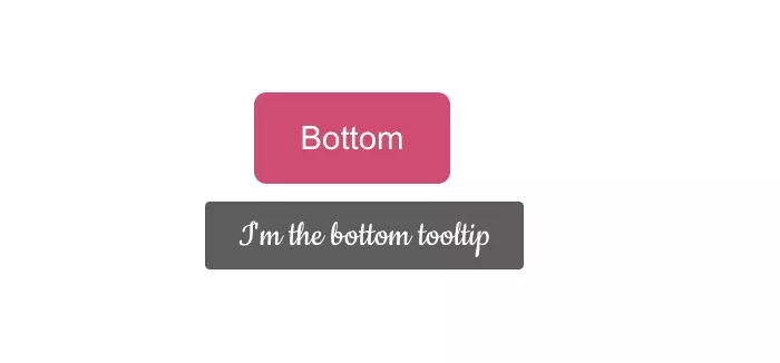
Positioning the tooltip to the bottom
Similarly to the top position, we kept the left edge offset and margin and positioned the tooltip 20% below its relative container using inset-block-start: 120% for the tooltip--bottom class selector, as follows:
.tooltip--bottom {
    inset-block-start: 120%;
    inset-inline-start: 50%;
    margin-inline-start: -60px;
}
And the tooltip will appear from the right side as shown below:
Next, we will implement the rules for the left position (or inline-start position).
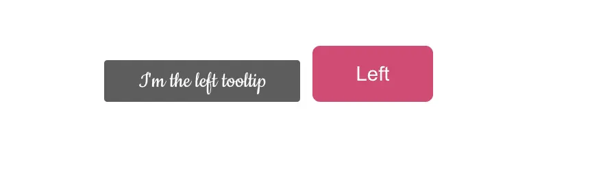
Positioning the tooltip to the left
For the left position, we offset the tooltip 10% from the right edge of its relative container using inset-inline-end: 110% while keeping both bottom edges aligned using inset-block-end: 0%, as shown in the following code:
.tooltip--left {
    inset-block-end: 0%;
    inset-inline-end: 110%;
}
The tooltip will appear from the left side as shown below:
Finally, we will implement the rules for the position on the right (or inline-end position).
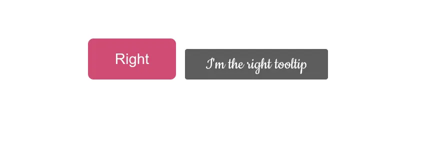
Positioning the tooltip to the right
Similar to the left position, we keep the bottom edges alignment and offset the tooltip 10% from the left edge of its relative container using inset-inline-start: 110%, as shown in the following code:
.tooltip--right {
    inset-block-end: 0%;
    inset-inline-start: 110%;
}
The tooltip will appear from the right side as shown below:
That's it. We have enabled the tooltip component with four different positions. With the tooltip displaying in a customizable place, we can now move on to the next step - adding an arrow (the triangle shape) to the tooltip and making it look better.
Adding an arrow to the tooltip with pseudo-element ::after
We can add an arrow tip to the tooltip for the sake of beauty by using the :after pseudo-element on the .tooltip__text element, with the following CSS rules:
- Set the
contentproperty to an empty string to create the pseudo-element. - Set the
positionproperty toabsoluteto remove the element from the normal flow of the page layout and be relative to its ancestor element with aposition: relativeset (.tooltip-wrapperin our case). - Use the
borderproperty to create the arrow shape, filling theborder-styletosolidand assigning value to theborder-width.
The below code demonstrates the above rules:
.tooltip__text::after {
    content: " ";
    position: absolute;
    border-width: 5px;
    border-style: solid;
}
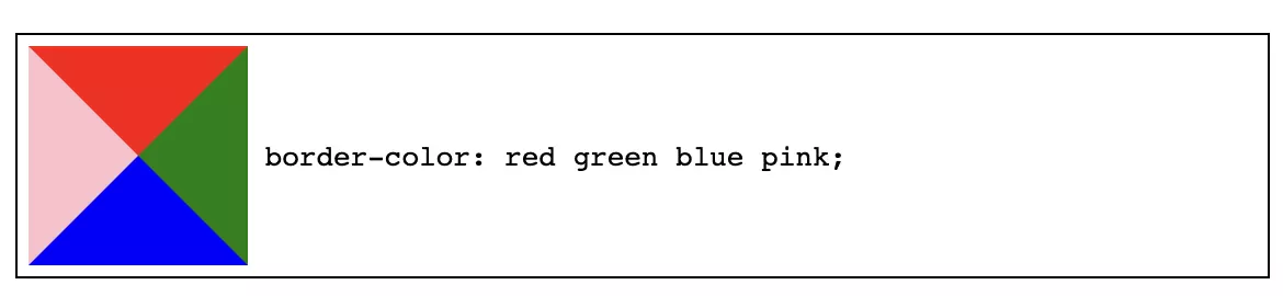
In an empty element (with no width/height), when we set the border-width to 5px, the whole piece will take 10px in width and height and be filled with the color of the border through border-color property. The color corner for each border side will overlap in the shape of a triangle. For instance, if we set border-color: red green blue pink for the top, right, bottom, and left sides, respectively, the element will have color filled as shown below:
And to create our arrow tip as a triangle shape, we take advantage of this mechanism by setting the color of the desired border side to the background color of the tooltip and the rest to transparent. Below is how the triangle looks for each different side when using border-color:
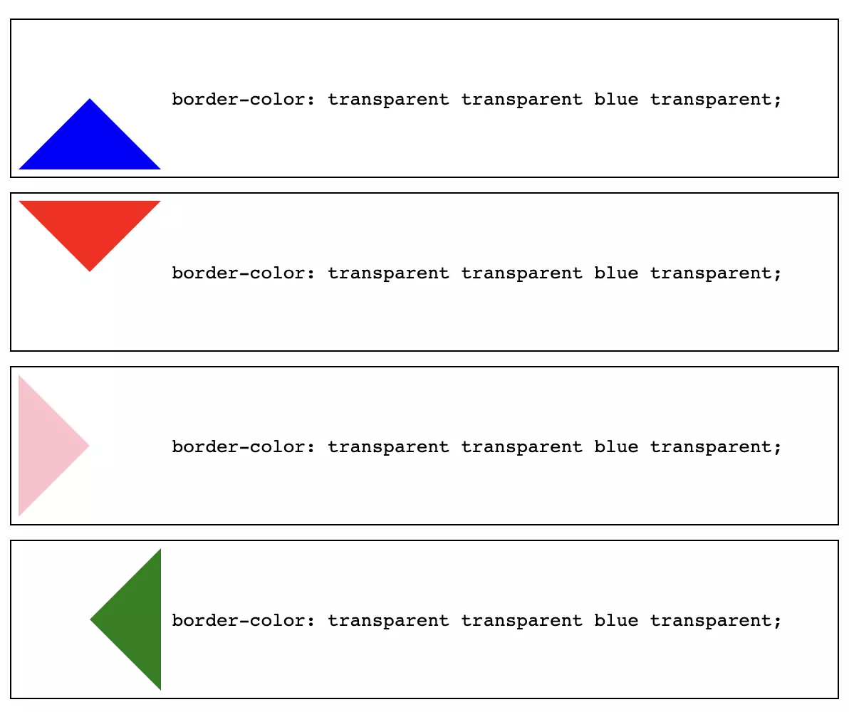
Based on the above, we can define the CSS rules for border-color for each position, as shown in the following table:
| Position | Border color |
|---|---|
| Top | #5e5d5d transparent transparent transparent |
| Bottom | transparent transparent #5e5d5d transparent |
| Left | transparent transparent transparent #5e5d5d |
| Right | transparent #5e5d5d transparent transparent |
And like the tooltip, we need to position the arrow tip. We can do that by setting the inset-block-start, inset-block-end, inset-inline-start, and inset-inline-end properties to the desired value, as seen in the following code:
.tooltip--left::after {
    inset-block-start: 50%;
    inset-inline-start: 100%;
    border-color: transparent transparent transparent #5e5d5d;
}

.tooltip--right::after {
    inset-block-start: 50%;
    inset-inline-end: 100%;
    border-color: transparent #5e5d5d transparent transparent;
}

.tooltip--top::after {
    inset-block-start: 100%;
    inset-inline-start: 50%;
    border-color: #5e5d5d transparent transparent  transparent;
}

.tooltip--bottom::after {
    inset-block-end: 100%;
    inset-inline-start: 50%;
    border-color: transparent transparent #5e5d5d transparent;
}
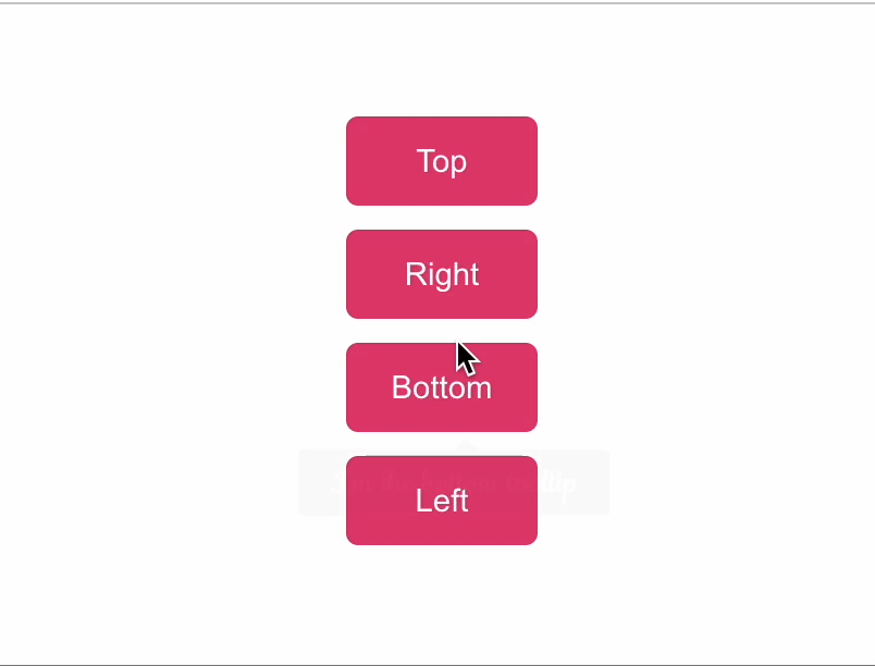
Straightforward enough. We now have a fully functional tooltip component that supports custom positioning, shows the tooltip on hover and focus, and has an arrow tip, as in the following screenshot:
Are we done? No, we still need to make the tooltip accessible to screen readers. Let's do that next.
Announce the tooltip content to screen readers
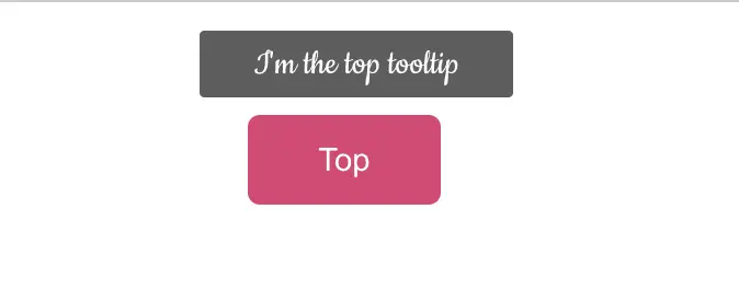
When navigating to the element with a tooltip, the screen reader needs to know a tooltip is associated with it and announce its content with the component. To do so, we use the aria-describedby attribute on the target element with the tooltip and pass a unique string representing the tooltip element's id, using the tooltip-id prop, as shown in the following code:
<Tooltip text="I'm the top tooltip" position="top" :tooltip-id="tooltipsIds.top">
 <button :aria-describedby="tooltipsIds.top">Top</button>
</Tooltip>
We will adjust the Tooltip component to accept tooltipId as a prop and apply it to the id attribute on the span element containing the tooltip's content, as follows:
<span :class="tooltipClasses" role="tooltip" :id="tooltipId">{{ text }}</span>
We must also assign the element's role as a tooltip for the screen readers to pick up. Doing so helps to prevent the tooltip from being announced twice, once when focusing on the target element and once when reaching the tooltip by the screen reader. We can also enable the inert attribute to ensure the browser will exclude the tooltip from the accessibility tree order and ignore any events within it, including events from assistive technologies.
<span :class="tooltipClasses" role="tooltip" :id="tooltipId" inert>{{ text }}</span>
Below is a demo of how the tooltip works with screen readers when navigating to the Top button:
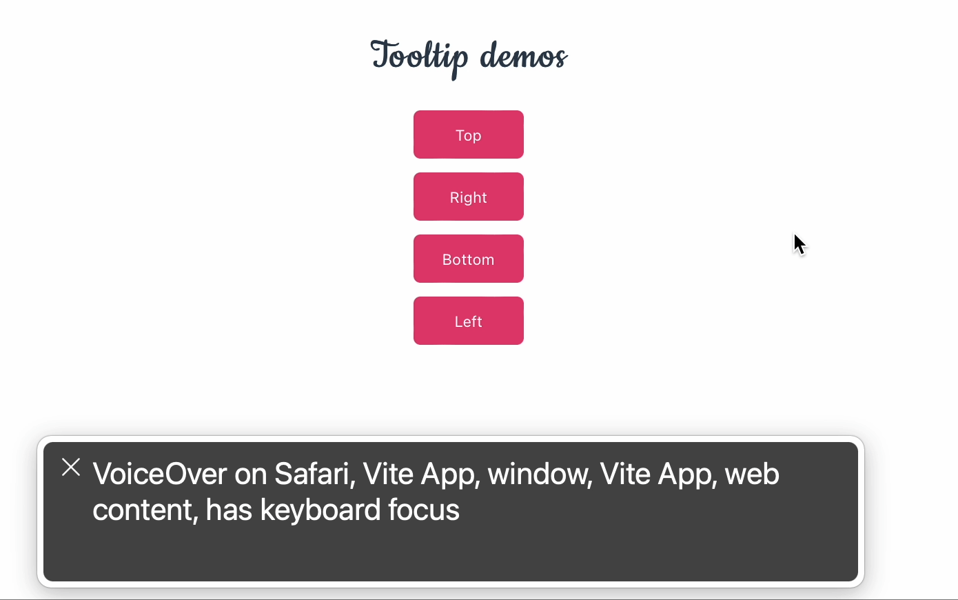
And our tooltip component is now accessible for assistive technologies like screen readers. Indeed, there are more things we can do to improve the component, such as allowing custom components within the tooltip and more. As for now, we have a fully functional and accessible tooltip component that we can use in our Vue projects.
Resources
You can find the source code for this tutorial on GitHub repo, and/or learn more about some of the topics covered in this post:
- ARIA Tooltip role
- CSS
inertproperty - CSS
insetproperty - Good accessibility practice in working with tooltips
- Adjacent sibling combinator
- Using
:slotted()for scope CSS
Summary
While using a component library seems convenient, there are better options to go for when working with components. Sometimes, it is better to create your components to have more control over the implementation and customization. We have learned how to create a tooltip component from scratch using Vue and CSS. And from this tutorial, you can extend the component to have more features, such as color customization, animation, and more.
What's next? How about implementing a second approach to create a tooltip as a Vue.js directive and see which one you prefer?
👉 If you'd like to catch up with me sometimes, follow me on Twitter | Facebook.
Like this post or find it helpful? Share it 👇🏼 😉
Learning Vue
Learn the core concepts of Vue.js, the modern JavaScript framework for building frontend applications and interfaces from scratch