Position your element with CSS inset logical property
In this tutorial, we will learn how to position an element using the inset logical property. We will also learn how the inset logical property differs from the physical properties like top, bottom, left, and right.
Table of Contents
- Table of Contents
- Understanding the
positionproperty - What are logical properties?
- Using the
insetlogical property to position an element insetlogical property vs. physical properties- Browser support
- Summary
Understanding the position property
The browser uses the position property to determine how to position an element in the page layout. The position property can have the following values:
static- the browser will position the element according to the normal flow and ignore any position-related properties such as top, bottom, left, right, z-index, and the logical property with theinsetprefix.staticis the default value for thepositionproperty for all HTML elements.relative- the browser will position any element with this position value relative to its normal position, according to other additional related properties. Also, the browser will not remove the component from the normal flow. Hence the element will still take up the same amount of space in the layout.fixed- the browser will align the element to the viewport, making it fixed in the same position regardless of the page scrolling. The element will no longer be in the regular layout flow of the page. This position is typical for navigation components like the footer, header, navigation bar, etc.absolute- the browser will position the element relative to the nearest positioned ancestor element (not static) and remove it from the regular layout. This position is common for components like modal, dropdown, tooltip, etc.sticky- the browser will position the element based on the user's scroll position.
Among these values, relative is considered closest to static as long as there is no extra helping property like top, bottom, etc. Hence, it is the most common solution for positioning any absolute elements concerning their parent container.
To understand how inset logical properties work in this tutorial, we use the position: absolute value as our example element and relative for its parent. But first, what are logical properties?
What are logical properties?
Unlike physical-based properties like vertical (top and bottom) and horizontal (left and right), CSS introduces logical properties based on the direction of the content flow or the movement of the writing mode (left-to-right, right-to-left, or vertical). Logical properties give us the ability to control layout logically, with two following dimensions:
- Block dimension - the vertical dimension of the element in horizontal writing mode and the horizontal otherwise.
- Inline dimension - the horizontal dimension of the element in horizontal writing mode and the vertical otherwise.

For example, in the horizontal writing mode (Latin, English, etc.), the start and end of the block dimension are the top and bottom of the element, and the beginning and end of the inline dimension are the left and right of the component, respectively.
Next, let's see how to use logical properties to position an element.
Using the inset logical property to position an element
We can use the inset logical property to define physical offset for the element's block and inline dimensions with the following syntax:
inset: <block-start> <inline-start> <block-end> <inline-end>;
The inset logical property is a shorthand for the following logical properties: inset-block, inset-inline, inset-block-start, inset-block-end, inset-inline-start, and inset-inline-end.
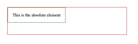
For example, when setting position: relative and position: absolute to the parent and child element, respectively, the child element's starting position will be the same as the parent element, as seen in the below screenshot:
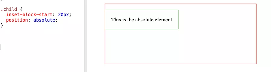
Then, we can set inset-block-start to 20px to have the child element positioned 20px below the parent element:
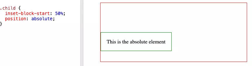
Alternatively, we can set a percentage as the value for inset-block-start. The browser will then calculate the position offset according to the parent's height:
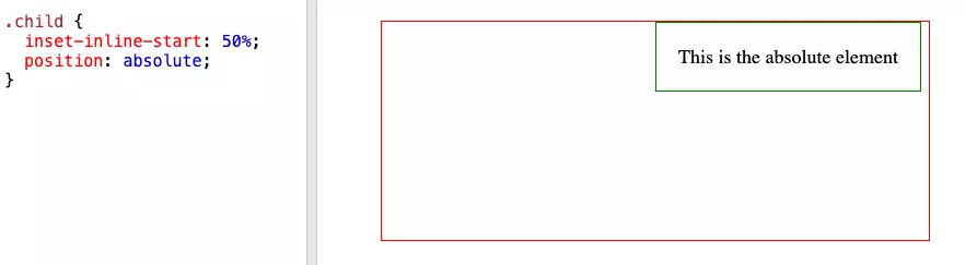
Similarly, we can also use inset-inline-start to position the element horizontally, such as 50% to set the element at the center of the parent element:
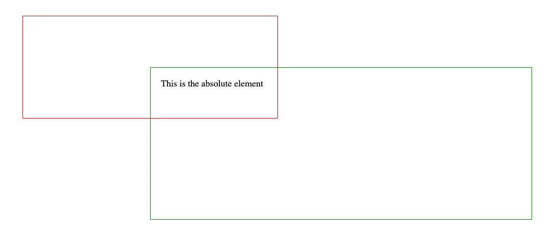
We can also use inset-block and inset-inline to set the offset for both block and inline dimensions, respectively:
.child {
    position: absolute;
    inset-inline: 50% -100%;
    inset-block: 50% -100%;
}
The above code will expand the child's width to 150% of the parent's width and its height to 150% of the parent's height. Then, the browser will position the child element starting from the center of the parent element in both dimensions, as shown in the screenshot below:
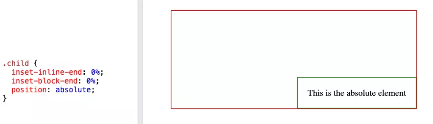
And if we set inset-inline-end and inset-block-end to 0%, the child element will be positioned at the bottom-right corner of the parent element:
That's it. We have learned how to position an element using the inset logical property. How does it differ from using physical properties like top, bottom, left, and right? Let's find out in the next section.
inset logical property vs. physical properties
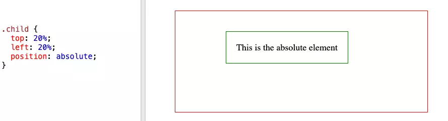
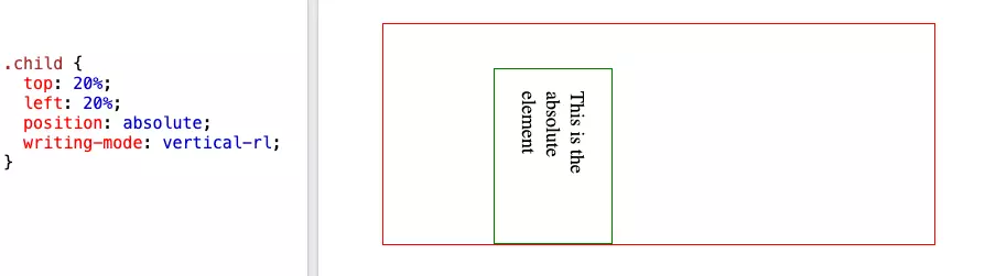
While the inset- logical properties accept the same value format as the physical properties, the browser will calculate the position offset differently, especially in writing mode that is not horizontal (left-to-right). For example, in the vertical writing mode (Chinese, Japanese, etc.) or horizontal mode, when using physical properties such as top and left, the browser continuously calculates the offsets from the top-left corner of the parent element as follows:
- Horizontal writing mode
- Vertical writing mode
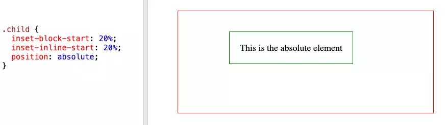
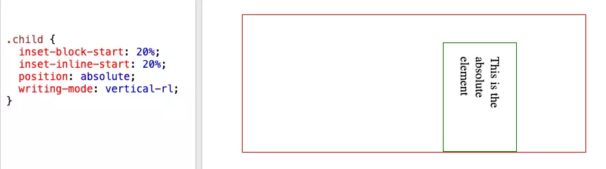
But when using the inset logical properties, the browser will calculate the offsets from the start of the block dimension and the start of the inline dimension, resulting in different position offsets, as follows:
- Horizontal writing mode
- Vertical writing mode
That said, while it is not straightforward to understand other physical properties, the inset logical properties are more flexible to use, especially when we want to support positioning in different typography. All we need is a bit of learning and practice to get used to it.
Browser support
The inset logical properties are supported in all major browsers so that you can use them in your projects immediately.
Summary
At this point, you should have a good understanding of the inset logical properties and how to use them to position an element. What's next? Try to replace any physical properties with the inset logical properties in your projects, and see how it works. Or you can explore other logical properties such as margin and padding and see how they work. If you have any questions, feel free to leave a comment below.
👉 If you'd like to catch up with me sometimes, follow me on Twitter | Facebook.
👉 Learn about Vue with my new book Learning Vue. The early release is available now!
Like this post or find it helpful? Share it 👇🏼 😉
Learning Vue
Learn the core concepts of Vue.js, the modern JavaScript framework for building frontend applications and interfaces from scratch