Build Kitty's hero banner with CSS background and linear-gradient

Hero banner plays a crucial role in setting your website's brand identity and attracting visitors to engage further. In this post, we will explore how to build a hero banner component with an image background using CSS HTML and alternatives.
First, let's explore what a hero banner is and why we need it.
Table of contents
- Table of contents
- What is a hero banner?
- Creating a hero banner with background-image property
- Apply a dark filter layer on the image with a linear-gradient function
- Generate the image with a dark filter effect using Cloudinary
- Accessibility concern when using the background-image property
- Summary
What is a hero banner?
A hero banner is the first visual impression that visitors see when they land on your website, and it plays a crucial role in setting your brand identity and attracting visitors to explore further. It is often a large image or video that appears at the top of your web application's homepage, and depending on the design, it may take up the entire screen or just a portion of it.
Designs of hero banners vary from one website to another, but they all have a few things in common:
- They are visually appealing and eye-catching (usually with a large image or video)
- They contain a short and simple message.
- They have a call-to-action (CTA) button that prompts visitors to take action, such as exploring further or signing up for a newsletter.
- They are optimized and visually consistent for different devices and resolutions.
Below is an example of a hero banner containing a large image, a short message, and a CTA button Get Started:

How do we create a basic hero banner with a background image? Let's find out next.
Creating a hero banner with background-image property
In this section, we will create a hero banner for Kitty, an excellent programmer,'s portfolio page that contains the following elements:
- A background image
- A heading text - "My name is Kitty"
- A small description text below the heading text - "And I'm the awesome 10x programmer"
- A CTA button - "Pet me!"
The HTML code for the hero banner is as follows:
<div class="hero-banner">
  <div class="hero-banner__content">
    <h1 class="hero-banner__heading">My name is Kitty</h1>
    <p class="hero-banner__description">
      And I'm the awesome 10x programmer
    </p>
    <button class="hero-banner__cta">Pet me!</button>
  </div>
</div>
We want a background image and display it behind the content, so we will use the CSS background-image property to set the background image for the hero banner. We also want to perform the following:
- Positioning the background to the center.
- Scaling its size to cover the entire container using
background-sizewithout filling the pattern usingbackground-repeat. - Set a fixed height for the hero banner.
- Position the content to the right of the hero banner with CSS Flex.
The CSS code is as follows:
.hero-banner {
  background-image: url("https://res.cloudinary.com/mayashavin/image/upload/v1607546879/cat_2");
  background-position: center;
  background-repeat: no-repeat;
  background-size: cover;
  height: 300px;
  display: flex;
  justify-content: flex-end;
}
Additionally, we will add some styles to the content to make it more visually appealing:
.hero-banner__content {
  padding: 20px 30px;
  color: white;
  display: inline-flex;
  flex-direction: column;
  justify-content: center;
  align-items: flex-end;
}

.hero-banner__heading {
  font-size: 3rem;
  margin: 0;
}
And some styles for the CTA button:
.hero-banner__cta {
  background-color: #039a63;
  color: white;
  border: #039a63;
  outline: #039a63;
  display: inline-block;
  padding: 10px 25px;
  text-align: center;
  cursor: pointer;
}

.hero-banner__cta:hover {
  background-color: #24a375;
}
Our hero banner now looks like this:

As you can see, the background image is too bright, making the content hard to read. We want to make the background image darker to make the content more visible. Let's see how we can do that.
Apply a dark filter layer on the image with a linear-gradient function
linear-gradient is a CSS function that generates images by creating a gradient (color map) along a linear direction (top, bottom, left, right) or an angle, starting with one color and ending with another.
The syntax of the linear-gradient function is as follows:
linear-gradient(
  [ <angle> | to <side-or-corner> ,]? <color-start> [, <color-stop>]+)
  \---------------------------------/ \----------------------------/
           Definition of the gradient             List of color stops
In which the to keyword specifies the direction. The starting point for gradient movement is the top left corner, and the default direction of the gradient is from left to right (to bottom).
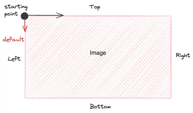
In our scenario, we can make our background a bit darker by placing a semi-transparent black layer on top. To do so, we first will use linear-gradient and generate a dark layer image with a default gradient from black to black (with 0.6 opacity for 40% transparency) as follows:
linear-gradient(rgba(0, 0, 0, 0.6), rgba(0, 0, 0, 0.6))
Then we place this generated image before our main image url(), in the value of background-image property, as in the following code:
.hero-banner {
  background-image:
    linear-gradient(rgba(0, 0, 0, 0.6), rgba(0, 0, 0, 0.6)),
    url("https://res.cloudinary.com/mayashavin/image/upload/v1607546879/cat_2");
    //...
}
This CSS rule will ensure placing the dark layer image on top of the main image, and that's it. Our hero banner now has an unclear effect on the background, and the content is more visible:

Quite a work. We must write a lot of CSS code to achieve the desired effect. Is there a way to do this without using linear-gradient? Let's discuss it in the next section.
Generate the image with a dark filter effect using Cloudinary
Cloudinary is a cloud-based image and video management solution that allows us to upload, manage, and deliver pictures with transformation effects on the fly using a simple URL-based API.
To create a variant of our image with the dark filter effect, we can follow the same approach by setting a background layer of black color using b_black, with an opacity of the layer to 40% using o_40, and add these transformations to the image URL after the image/upload section, as follows:
url("https://res.cloudinary.com/mayashavin/image/upload/b_black,o_40/v1607546879/cat_2")
We can then remove the linear-gradient function from the background-image property:
.hero-banner {
  background-image:
    url("https://res.cloudinary.com/mayashavin/image/upload/b_black,o_40/v1607546879/cat_2");
    //...
}
And the result stays the same.
Alternatively, you can use the NPM package cloudinary-build-url to generate the image URL with the desired transformations programmatically using TypeScript/JavaScript. The code is as follows:
import { buildUrl } from "cloudinary-build-url";

const imageUrl = buildUrl("<your-image>", {
  cloud: {
    cloudName: "<your_cloud_name>",
  },
  transformations: {
    opacity: 40,
    background: "black",
  },
});
The above code will yield the same URL with the transformations inside.
Accessibility concern when using the background-image property
When displaying an image as a background image, it is not part of the HTML content and is not accessible to screen readers. This approach means that screen readers cannot read the image content. Hence, if you want to display an image with meaningful content that requires users to acknowledge/understand, you should not use background-image property.
Summary
We have explored different methods of creating a hero banner using CSS background-image with the help of linear-gradient() function and Cloudinary. We have also learned how to use linear-gradient function to generate a dark layer image and place it on top of the main image to create a dark filter effect.
Now it's your turn to experiment and create your version of a hero banner or a beautiful landing page with these techniques 😉. Have fun!
👉 Learn about Vue with my new book Learning Vue. It is available now!
👉 If you'd like to catch up with me sometimes, follow me on Twitter | Facebook | Threads.
👉 Want to support me? Buy me a coffee.
Do you like this post or find it helpful? Share it 👇🏼 😉
Learning Vue
Learn the core concepts of Vue.js, the modern JavaScript framework for building frontend applications and interfaces from scratch
