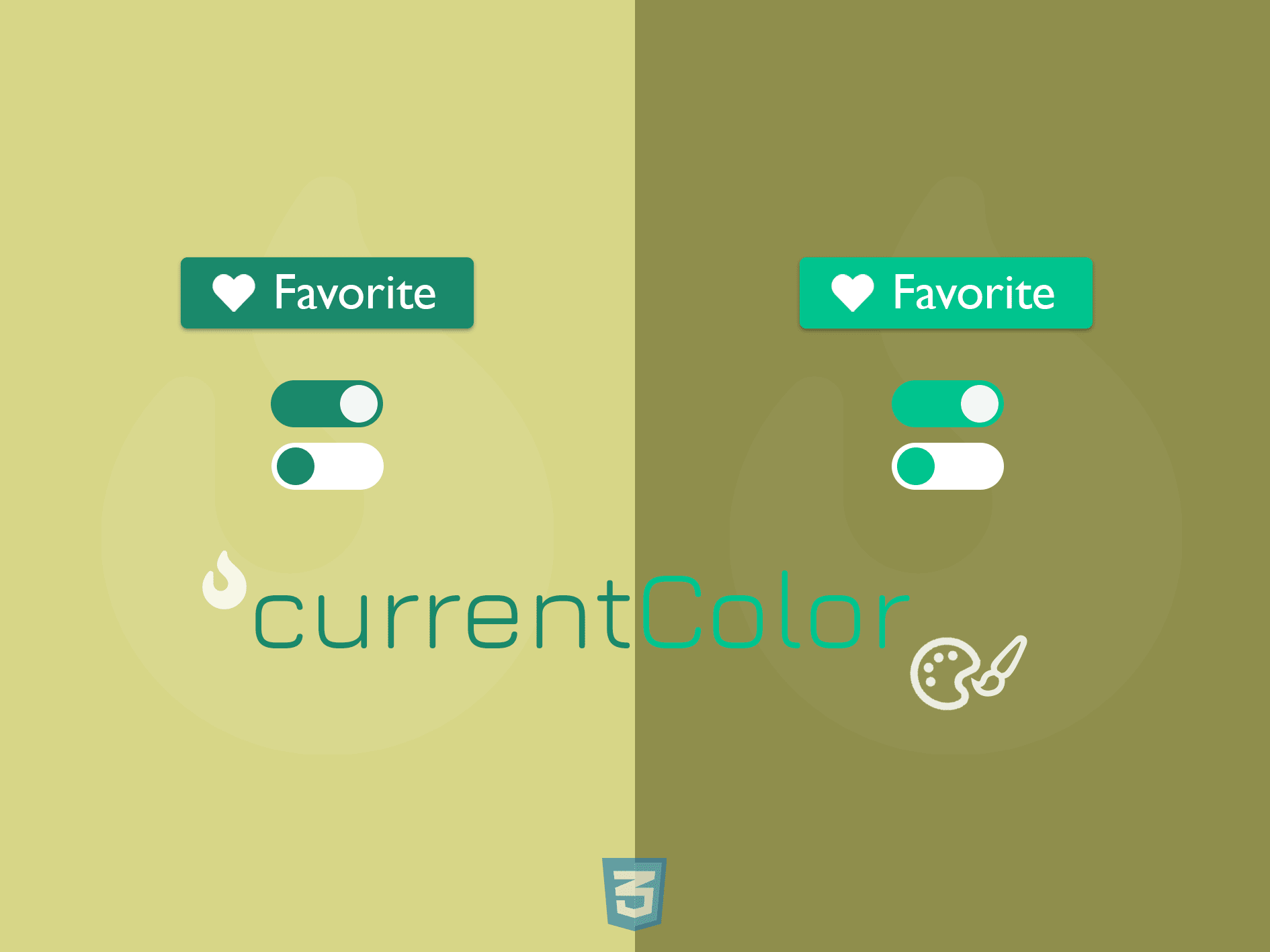
Making reusable SVG icons and consistent color theme for components while keeping the style sheets short is now achievable with currentColor - a CSS Module 3 variable. But what’s exactly is currentColor? And how do we achieve color consistency and create reusable SVG icons with it?
Let’s find out.
What is currentColor?
currentColor is a CSS variable that contains the computed value of the closest color property being used on an element.
In short, the value of
currentColor= value of the closetcolorproperty.
currentColor is not a custom variable, and its value is read-only; hence we can’t override or assign a value to it.
For example, to give currentColor a blue value:
/* Invalid syntax */
h1 {
 currentColor: blue;
}

/* Correct syntax */
h1 {
 color: blue;
}
We can map the value of currentColor to any property that can receives color. Let’s look at the following example:
<div class="textbox">
 <h1>My box shadow should be blue</h1>
</div>
Assume we already have color of h1 is set to blue . We can assign the color value of border to currentColor, as shown below:
.blue-border {
 border: 1px solid currentColor;
}
When we add blue-border to h1 element
<h1 class="blue-border">
  My border should be blue
</h1>
The result will be:

The border now takes the same color as the text. Simple as that.
Next question - what if we don’t set any text color for h1, how do currentColor pick up the right color?
Color inheritance with currentColor keyword
Like other CSS variables, it follows the Cascading rule, which means if there is no color property existed in the CSS ruleset of an element, it will inherit the color property from the closest ancestor of the component. If there is no color in any ancestor, currentColor will automatically receive the fallback value defined by the browser, which is most likely black.
Take the following DOM tree structure, for instance:
<html>
    <head><!-- header code --></head>
    <body>
    <div class="section purple" id="section">
      <div class="box-wrapper green" id="box-wrapper">
          <div class="box-1 box blue" id="box-1"></div>
          <div class="box-2 box" id="box-2"></div>
      </div>
    </div>
  </body>
</html>
In which, the element div#section has color set to purple with purple class, the element div#box-wrapper has green class, and our target element div#box-1 has blue class for color. For experimenting, we add the following to any element with class box (including our target element)
background: currentColor;
The following describes how color inheritance works for currentColor for div#box-1 element and div#box-2 according to the above structure

A more detailed explanation diagram is as below:

But not all properties really need access to currentColor. While some can inherit the value of color , a few other properties need help to get the right color. For such properties, currentColor is extremely helpful.
So which property does not need currentColor’s help and which one needs?
Color inheritance in CSS
There are many CSS properties have color inheritance enabled by default, including:
border-colorborderoutlineandoutline-colorfor text elementcolorbox-shadow
Also, all text elements, including alt text of an image will inherit color value, unless there is a different color is assigned to them explicitly.
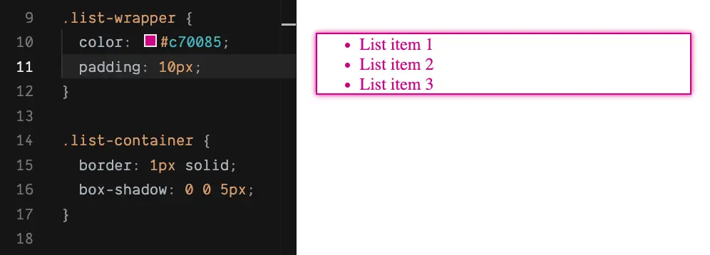
Take the following for example:
<div class="list-wrapper">
    <ul class="list-container">
        <li>List item 1</li>
        <li>List item 2</li>
        <li>List item 3</li>
  </ul>
</div>
Once the color of the parent div changes, color of all related properties and text elements changes as well.

For the above scenarios, there is no need for using currentColor . Otherwise, currentColor is essential to enable color inheritance between elements, such as theming and building consistent SVG icons.
Let’s take a look at these use cases, shall we?
Build your reusable icon component with SVG and currentColor
Using SVG for icons is a recommended practice, for many good reasons. And there are many approaches to create a reusable SVG icon component. A straightforward method is to create SVG sprite with use and symbol elements.
Create SVG sprites with use
The most straightforward is to create a container for icons using <svg> element as the sprite. We wrap each icon with <symbol> and reuse it with use. <symbol> is an nested element of SVG and allows us to define an icon without rendering it on screen. Only when there is a reference to that icon using <use> element. Consider the following SVG icons sprite container, for instance:
<body>
    <svg style="display: none">
        <symbol viewBox="0 0 32 32" id="heart-icon">
        </symbol>
    </svg>
</body>
We assign an id to the icon symbol, and then re-use this heart icon anywhere in the page by referencing to its id with <use> , such as in a text button:
<button class="favorite-btn">
  <svg width="24px" height="24px">
    <use xlink:href="#heart-icon"></use>
  </svg>
    Favorite me!
</button>
And a bit of CSS to make the button's content aligned.
.favorite-btn {
  display: flex;
  align-items: center;
}
That’s it. The button will looks like:
![]()
What if we want to this button to render in white text with purple background?
Adding color
For the button’s background and text color, we can add the CSS styles to the button according to its class favorite-btn, as follows:
.favorite-btn {
    /*...*/
  background: #3d1472;
  color: white;
}
The button looks like:

The icon color, unfortunately, is not in sync with the button text. To change its color, we can use the fill property with a proper value:
.favorite-btn svg {
  fill: white;
}
Now we get the button rendered correctly:

If we want to change the text color of the button to grey on hover and match the icon color accordingly, we will need to add two additional rule sets in the CSS file:
.favorite-btn:hover {
  color: grey; // color for button text
}

.favorite-btn:hover svg {
    fill: grey; // color for icon
}
This solution is not optimal, especially when you have more text buttons with icons in different colors, in different scenarios (hover, active, etc.). It requires to write at least two CSS rule sets per button, two extra rule sets per button state, hence making our CSS file long and hard to maintain.
Any better solution? Use currentColor 😉
Simply set the value of fill to currentColor for any svg element:
svg {
    fill: currentColor;
}
We no longer need the CSS style for favorite-btn svg selector. So our CSS code now will be:
.favorite-btn {
  background: #3d1472;
  color: white;
}

.favorite-btn:hover {
    color: grey;
}

svg {
  fill: currentColor
}
And our icon’s color will automatically match the button’s text color. Also, changing the button’s text color will only require modification in the button container's CSS style. Less code, a shorter CSS file, and less bug 🐛.

Easy right? Feel free to try out the code demo yourself here
How about the next use case - theming with currentColor?
Theming with currentColor and CSS custom variables
I previously showed and wrote a post about how to dynamically customize a dark/light mode theme with CSS custom variables. So what benefit currentColor can add to theming besides?
Consider we have a slide component for input range as follows:

And we want to achieve the consistent look and feel for dark/light mode according to the below themes:

With the help of CSS custom variables, we can define the primary color for the app as below
:root {
    --page-bg-dark-mode: #808080;
    --page-color-dark-mode: #69bac9;
  --page-color-light-mode: #0b4491;
}

.dark-mode {
  background: var(--page-bg-dark-mode);
  color: var(--page-color-dark-mode);
}

.light-mode {
  color: var(--page-color-light-mode);
}
For the toggle, we use currentColor for the background of the input range to inherit the theme color automatically.
.input-range {
  /* ... */
  background-color: currentColor;
  color: inherit; /* make sure input text color is consistent with the theme */
}
And tada 🎉, we get a component reactive to the theme changed

Awesome. You can experiment with the full code here and easily add more components such as slider, checkbox, etc. to create your own design system. After all, why not? 😊
Summary
Large CSS files cause longer TTFB (time to the first byte) and first paint, hurting the site’s overall performance. Also, it’s harder to read and maintain them in the long run. With currentColor, we can finally automate theming while keeping the CSS short, in combination with other tools such as custom variables.
Also, we finally can KISS rule to CSS stylesheets and make them DRY (don’t repeat yourself), so what else are you waiting for?
Have some new showcases with currentColor? Hit me up 🔥.
👉 If you'd like to catch up with me sometimes, follow me on Twitter | Facebook.
Like this post or find it useful ? Share it 👇🏼 😉
Learning Vue
Learn the core concepts of Vue.js, the modern JavaScript framework for building frontend applications and interfaces from scratch
