Build an accessible text field component with React

Writing accessible components, as many developers believe, is a challenging task. However, with the appropriate structure and component design, you can achieve accessibility quickly, starting from the essential ones.
In this article, we are going to implement a TextField component using React and TypeScript, which has the following features:
- A
labeland aninputelement, - An Edit
buttonnext to the label controls the edit mode of the input. We call this the self-edit mode. - Clicking on the Edit
buttonwill change theinputto editable and auto-focus on the input field. Once done editing, the focus returns to the previously focused element - the Edit button. - When it is in edit mode of self-edit, you can cancel or save the edited value.
- It has to be accessible, with screen reader support and keyboard navigation.
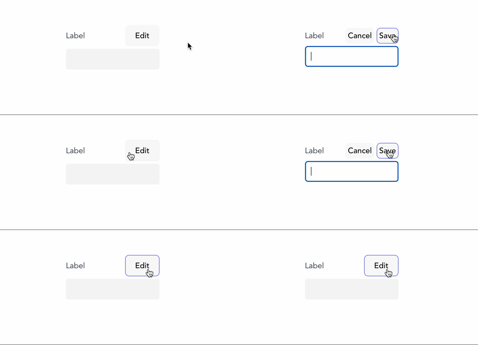
An example UI design of this component is as below:

Let's start by creating the component, shall we?
Creating TextField component
From the mockup above, we will start with the basic implementation of the component, including an input field and a label.
export function TextField () {
 return (
  <div className="textfield--wrapper">
    <div className="textfield--header">
       <label></label>
    </div>
   <input />
  </div>
 )
}
Since we want this TextField component to behave similarly to an input field, we will make sure it receives the following props:
id- the unique id we use to identify theinputfieldlabel- the label text to displayplaceholder- the placeholder for the input. It should be optional.- Any other input's good attributes and events.
The above requirements indicate our component props' interface will look like the following:
import { InputHTMLAttributes } from "react";

interface TextFieldProps extends InputHTMLAttributes<HTMLInputElement> {
    label: string;
}
In the above TypeScript code, our TextFieldProps inherits the attributes defined for HTMLInputElement, with an additional string field - label. Now let's map our props to the designated places, such as label, id, and other input props. We need to make sure label describes our input field by using htmlFor (instead of for in plain HTML), as follows:
export function TextField ({ id, label, ...props }: TextFieldProps) {
 return (
  <div className="textfield--wrapper">
    <div className="textfield--header">
        <label htmlFor={id}>{label}</label>
    </div>
   <input id={id} {...props} className="textfield--input"/>
  </div>
 )
}
And we also added a bit of CSS to make our component looks organized:
.textfield--wrapper {
    display: flex;
    flex-direction: column;
    gap: 5px;
}

.textfield--header {
    display: flex;
    align-items: center;
    justify-content: space-between;
}

.textfield--input {
    padding: 10px;
    border-radius: 5px;
    font-size: 1rem;
}
Our TextField component is ready for primary usage with the above CSS code as an input field. Next, we will add the edit mode to control the input field's editable mode.
Adding the self-edit control mode
First, we will create a local state editMode using useState, which receives an initial value false, as follows:
const [editMode, setEditMode] = useState(false)
We then use this editMode state to control whether we want to allow our input to be read-only.
<input id={id} {...props} readOnly={!editMode} className="textfield--input" />
Now let's add some button actions to allow the user to control the state editMode, shall we?
Controlling the edit mode of TextField component
From our initial design, to control the editMode from the client side, we need to display the following actions:
- Edit - turn on the edit mode, and is visible when
editModeisfalse. - Cancel - visible when
editModeistrueand allows the user to return to read-only mode without saving. - Save - visible when
editModeisfalse. It allows the user to trigger an externalonSavefunction and save the new edited text value.
Sounds pretty straightforward enough. We modify the header of the TextField component to include three action buttons, with Save/Cancel appearing only when editMode is true, and Edit otherwise:
    <div className="textfield--header">
        <label htmlFor={id}>{label}</label>
        { editMode ? (
            <div className="textfield--header-actions">
                <button className="textfield--header-action">Cancel</button>
                <button className="textfield--header-action">Save</button>
            </div>
        ) : (
            <button className="textfield--header-action">Edit</button>
        )}
    </div>
We now toggle editMode whenever the user clicks on the Edit button and on the Save/Cancel button, respectively, by defining the following functions:
const closeEditMode = () => {
    setEditMode(false)
}

const openEditMode = () => {
    setEditMode(true)
}

const onEditHandler = () => {
    closeEditMode();
}
And then we bind those functions to the related buttons' onClick events, as follows:
{ editMode ? (
    <div className="textfield--header-actions">
        <button onClick={closeEditMode} className="textfield--header-action">Cancel</button>
        <button onClick={onEditHandler} className="textfield--header-action">Save</button>
    </div>
) : (
    <button onClick={openEditMode}>Edit</button>
)}
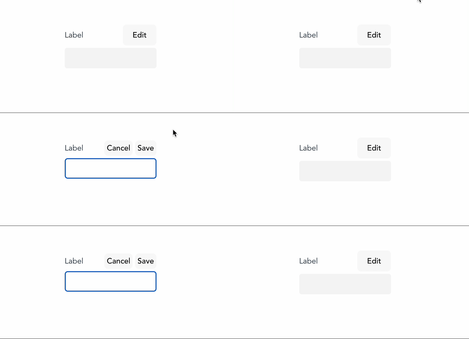
Our TextField component now behaves as follows:

The following section will explore a more advanced accessible support feature - focus-ability.
Where is my focus?
Accessibility is not only about screen readers. It is also about providing navigation support to the user, in which focus plays an important role. Focus allows the user with any alternative navigation (such as a keyboard) to locate their location on the page, helping them navigate a complex page.
At this stage, we add the feature to toggle the edit mode of the input. We will ensure when the edit mode is on, the browser will automatically focus on the input field. And when the edit mode is off, the browser will return the focus to the Edit button.
Focusing on the input when switching to edit mode
To change the focus from the button to the input field when edit mode is on, we use the useRef() and useEffect() hooks.
First, we will create a reference variable inputRef and assign it to the ref attribute of the input field, as follows:
const inputRef = useRef<HTMLInputElement>(null);

//other logic

return (
    <div className="textfield--wrapper">
        <div className="textfield--header">
            <!--...-->
        </div>
       <input id={id} {...props} readOnly={!editMode} ref={inputRef} className="textfield--input"/>
    </div>
)
Next, we use useEffect() to focus on the input element whenever editMode is true.
useEffect(() => {
    if (!editMode) return;

    inputRef?.current?.focus()
}, [editMode])
That's it. Now we have the input focused when the user switches to edit mode.

However, we still have one problem. When you click the Save button, notice that you will lose focus on the Edit/Save button after component updates. Behind the scenes, React destroyed the previous button element for Save and replaced it with a different button element, thus caused the missing focus.
At this point, the browser loses track of the currently focused element (since it is no longer there) and automatically returns the focus to the main window. This behavior occurs since the focus is no longer on the last focused element (the last button element no longer exists). Users won't notice the difference in the UI, but when they try to continue navigating using the keyboard, they will need help understanding where their focused element is.
We will solve this challenge next.
Returning the focus to the Edit button
To solve this returning focus challenge, we first modify the component's HTML structure for the actions to be the following:
<div className="textfield--header-actions">
{editMode && (
    <button onClick={closeEditMode} className="textfield--header-action">Cancel</button>
)}
    <button
        onClick={editMode ? onEditHandler : openEditMode}
        className="textfield--header-action"
    >
        {editMode ? 'Save' : 'Edit'}
    </button>
</div>
By doing so, whenever we click on Save, the browser will maintain the focus on the Edit button. Since the button is the same, its label and bind onClick action changed.
However, we still need to return the focus to Edit when clicking the Cancel button. For such scenarios, we keep a reference to the Edit button by using useRef, as follows:
const editBtnRef = useRef<HTMLButtonElement>(null)
Then we attach it to the target button, as in the below code:
<div>
{editMode && (
    <button onClick={closeEditMode} className="textfield--header-action">Cancel</button>
)}
    <button
        className="textfield--header-action"
        ref={editBtnRef}
        onClick={editMode ? onEditHandler : openEditMode}>
        {editMode ? 'Save' : 'Edit'}
    </button>
</div>
In the closeEditMode function, we will re-focus on the target button if editMode is false, as in the following:
const closeEditMode = () => {
    setEditMode(false);
    editBtnRef?.current?.focus();
}
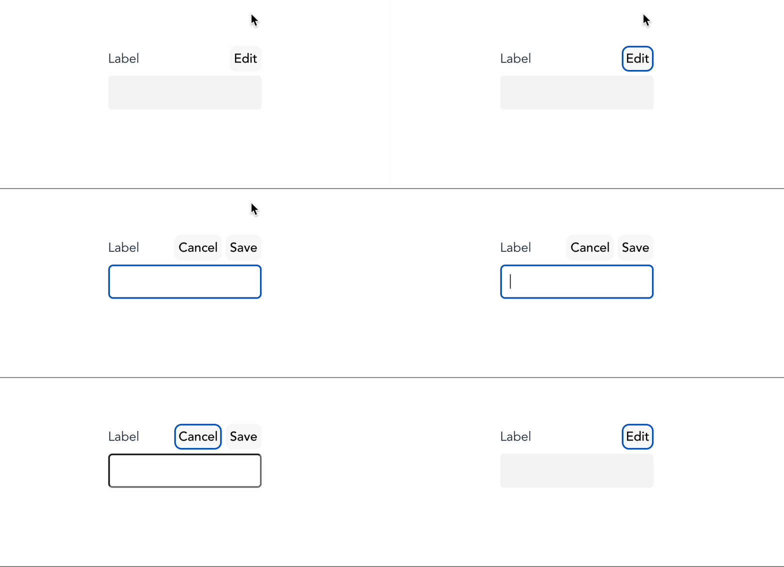
Great. Now our component is enabled with full focus mode supported:

Next, we will modify our buttons to use icons instead and explore how to ensure our component is fully accessible for visibility and screen readers.
Making icon buttons accessible using ARIA attributes
To make our TextField look like the design mockup, we will replace the Save/Edit/Cancel buttons with the following icons - SaveIcon, EditIcon, and CancelIcon components, respectively. Each of those is an SVG React component (you can download them via Icones, but you can use any other icon generators.
{editMode && (
    <button onClick={closeEditMode} className="textfield--header-action">
        <CloseIcon  />
    </button>
)}
<button
    className="textfield--header-action"
    ref={editBtnRef}
    onClick={editMode ? onEditHandler : openEditMode}
>
    {editMode ? <SaveIcon /> : <EditIcon />}
</button>
Since the screen reader won't be able to read the icon button due to the lack of a descriptive label, we use aria-label to provide a readable label of the icon button for screen readers, in addition to a built-in attribute title, as shown below:
{editMode && (
    <button
        className="textfield--header-action"
        onClick={closeEditMode}
        aria-label="Cancel"
        title="Cancel"
    >
        <CloseIcon  />
    </button>
)}
<button aria-label="Edit" title="Edit"
    className="textfield--header-action"
    ref={editBtnRef}
    onClick={editMode ? onEditHandler : openEditMode}
    aria-label={editMode ? 'Save' : 'Edit'}
>
    {editMode ? <SaveIcon /> : <EditIcon />}
</button>
Unlike some ARIA attributes, the title attribute is HTML-native and supported by all browsers. You need title to display a short description tooltip of the target button when hovering, making it easier for the user to understand what the button is about. We also need to set aria-hidden to true for the icon, so the screen reader will skip reading the icon, as shown below:
{editMode && (
    <button
        className="textfield--header-action"
        onClick={closeEditMode}
        aria-label="Cancel"
        title="Cancel"
    >
        <CloseIcon aria-hidden="true" />
    </button>
)}
<button
    className="textfield--header-action"
    ref={editBtnRef}
    onClick={editMode ? closeEditMode : openEditMode}
    aria-label={editMode ? 'Save' : 'Edit'}
    title={editMode ? 'Save' : 'Edit'}
>
    {editMode ? (
        <SaveIcon aria-hidden="true" />
    ) : (
        <EditIcon aria-hidden="true" />
    )}
</button>
The following screenshot describes how the screen reader picks up the buttons.
From the screenshot above, notice that on keyboard focus for any of the buttons, there is no tooltip, unlike in hover. Without any tooltip or title, some users may find it hard to understand what the button is for. One approach to handling such cases is using the pseudo element after of the class textfield--header-action when the target element is on focus:
.textfield--header-action[title]:focus::after {
    content: attr(title);
    background-color: black;
    color: white;
    padding: 5px;
    margin-top: -2.3em;
    position: absolute;
    max-width: 200px;
    border-radius: 5px;
    z-index: 1;
}
In the above code, we take the attribute title value using attr(), assign it to the content property, and add other CSS rules to position and beautify the tooltip. Now when in focus mode, our buttons will have a small tooltip, as shown in the following screenshot:

At this stage, our component is accessible, but not enough. Since we control the input's editable mode outside of these actions, we must also reflect that on the screen readers, which we will explore next.
Indicating the control element for the input field using aria-controls
We should use aria-controls to indicate the control of these buttons towards the visibility/state of the input field by its id, and complete the user experience as follows:
{editMode && (
    <button
        className="textfield--header-action"
        onClick={closeEditMode}
        aria-label="Cancel"
        title="Cancel"
        aria-controls={id}
    >
        <CloseIcon aria-hidden="true" />
    </button>
)}
    <button
        ref={editBtnRef}
        onClick={editMode ? onEditHandler : openEditMode}
        aria-label={editMode ? 'Save' : 'Edit'}
        title={editMode ? 'Save' : 'Edit'}
        className="textfield--header-action"
        aria-controls={id}
    >
        {editMode ? (
            <SaveIcon aria-hidden="true" />
        ) : (
            <EditIcon aria-hidden="true" />
        )}
    </button>
And the screen reader will pick up the desired information and announce it to our users accordingly.
Lastly, we will ensure the component receives and binds the external onSave event for the related actions.
Saving your input changes
To enable updating the input's values externally, we can modify the TextFieldProps to accept an onSave asynchronous function, which receives input value, and returns a Promise, as follows:
interface TextFieldProps extends InputHTMLAttributes<HTMLInputElement> {
    label: String;
    onSave?: (value: any) => Promise<void>
}
Then we modify onEditHandler to trigger onSave with the current value of the input, as shown in the following code:
const onEditHandler = async () => {
    const currentValue = inputRef?.current?.value;

    const onSavePromise = await onSave?.(currentValue);

    closeEditMode();

    return onSavePromise;
}
That's it. Our component is complete and will render the following UI for non-edit mode:

And for edit mode:

One additional recommendation is to create a component that renders a hidden screen reader text and use it with aria-describedby to provide more descriptive context besides the regular arial-label.
Furthermore, you can add onCancel or any other props to allow more customizations to the component or modify the implementation to match your look and feel, as well as add further props to the label such as asterisk icon for required field's label, etc.. Let your imagination go wild ;)
You can find the complete working code here.
Summary
Building an accessible TextField component is not as complex as most of us may think. Nevertheless, making it accessible requires effort to play around with screen readers and keyboard navigation to fully understand how other users may feel when using your application.
The TextField component in this article is uncontrollable. It has its state for editing. If we want to use it in a form where we need to control the edit mode externally, we have to modify the component's logic slightly. The following article will explore how to turn the element into a controllable and accessible TextField.
👉 If you'd like to catch up with me sometimes, follow me on Twitter | Facebook.
Like this post or find it helpful? Share it 👇🏼 😉
Learning Vue
Learn the core concepts of Vue.js, the modern JavaScript framework for building frontend applications and interfaces from scratch
