Dialogs and modals are the essential components for any web application. Still, it takes quite an effort for us to create and define default behavior logic for it using the existing div element. As a result, we usually end up with a third-party dialog component to save the day.
But now, we have the dialog element, which is now fully supported by all major browsers according to the latest Google I/O 2022 updates for the Web platform.
So let's check out the dialog element, shall we?
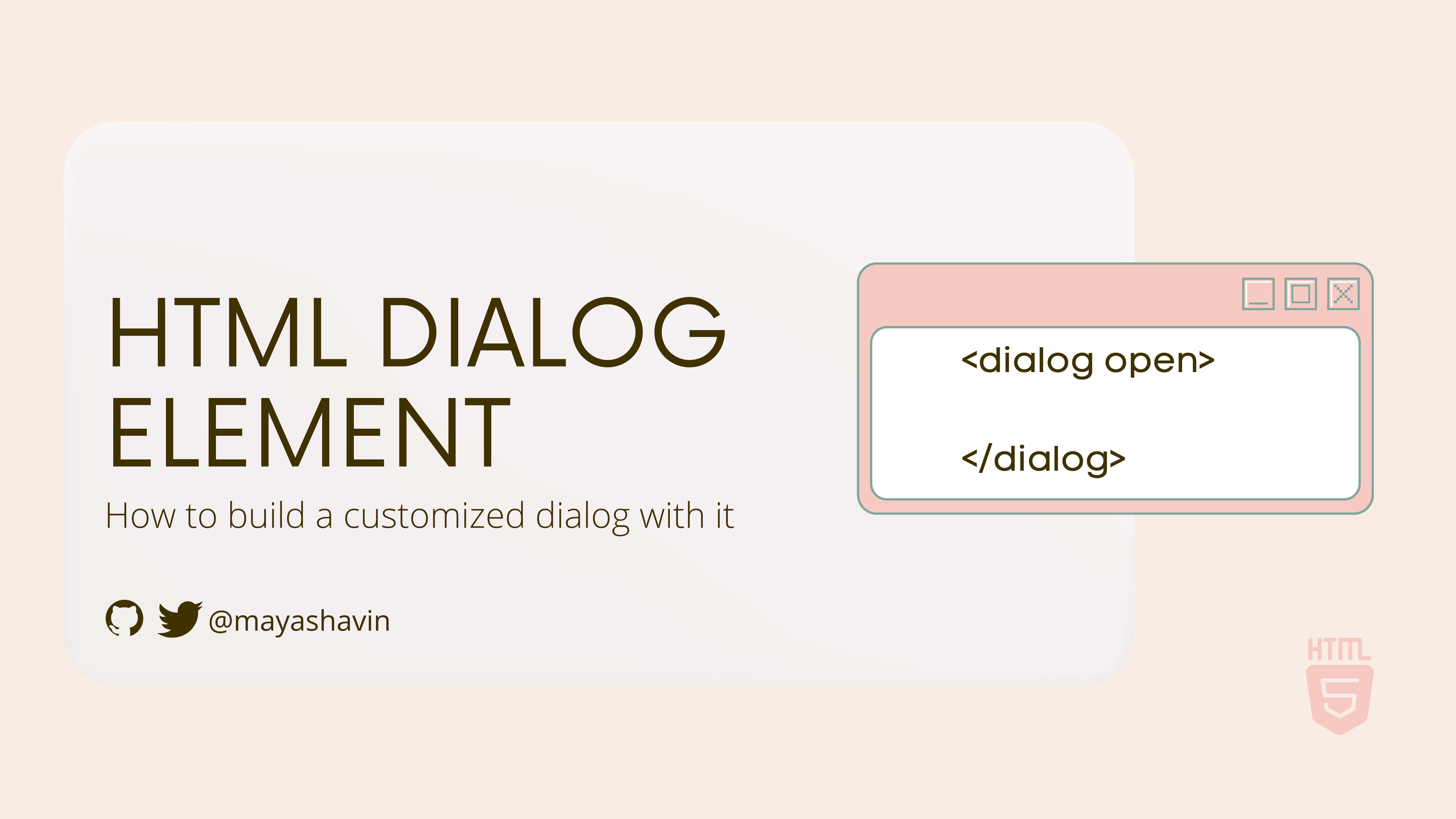
Introducing dialog element
Dialog element dialog is a pretty new HTML5 element, and you can use it with the <dialog> markup, as shown in the example below:
<dialog>
    <div>
        I'm a dialog!
    </div>
</dialog>
Unlike other HTML5 elements, the dialog element comes with built-in APIs and some basic CSS stylings. By design, the dialog element has two states - visible (open) or hidden (close), indicated by a single property open:
<dialog open>
    <div>
        This dialog is opened and visible!
    </div>
</dialog>

<dialog>
    <div>
        This dialog is hidden!
    </div>
</dialog>
The initial state of dialog is "hidden". The dialog element exposes the following API methods to control its conditions:
showModal()- open the dialog by setting the attributeopento the element. It also adds a::backdroppseudo-element to cover the content outside of the element as an overlay effect.show()- similar likeshowModal, but without adding a backdrop. This method is useful for using thedialogas a toast notification.close(newReturnValue)- close the dialog by removing theopenattribute, and updating thereturnValueof thedialogelement if there is anynewReturnValuepassed.
With the given APIs above, let's implement a simple dialog next.
Create a simple dialog
We are going to create a simple dialog containing three sections:
header, which has the dialog title and a cancel button (with an X indicator)divsection where we display all the content for the dialog. In our example, it will be just a simple string.footercontains amenuof action buttons, such as Cancel and Confirm buttons.
A sample sketch of our dialog is as below:

Now let's add a dialog markup element with the above sections to the body section of an HTML file. The dialog has an id attribute with the value main-dialog, as shown below:
<html>
    <body>
        <dialog id="main-dialog">
            <header>
                <h2>Dialog header</h2>
                <button>X</button>
            </header>
            <div>
                Dialog content
            </div>
            <footer>
                <menu>
                    <button>Cancel</button>
                    <button>Confirm</button>
                </menu>
            </footer>
        </dialog>
    </body>
</html>
Next, we add to the body a main element that contains a button to open the dialog:
<body>
    <main id="app">
        <button id="open-dialog-btn">Open dialog</button>
    </main>
    <dialog id="main-dialog">
        <!--....-->
    </dialog>
</body>
When running the about code on the browser, you won't see the dialog as it is not visible by default. We need to bind the onclick event of the button with id "open-dialog-btn" using the addEventListener method as follows:
//1. Query for open dialog button
const openBtn = document.getElementById('open-dialog-btn');

//2. Query for dialog element
const dialog = document.getElementById('main-dialog');

//3. Add event listener to open dialog on click
openBtn.addEventListener('click', () => {
    dialog.showModal();
})
Refresh the browser, and you now can see the dialog is open whenever you click the Open dialog button:

Once the dialog is open, we must bind the other menu buttons and the header button to the proper event handlers and close the dialog accordingly. To do so, we add the relevant id to the button controls:
<header>
    <h2>Dialog header</h2>
    <button id="dialog-header--cancel-btn">X</button>
</header>
<div>
    Dialog content
</div>
<footer>
    <menu>
        <button id="dialog-footer--cancel-btn">Cancel</button>
        <button id="dialog-footer--confirm-btn">Confirm</button>
    </menu>
</footer>
Then query and bind the click event on these buttons to trigger dialog.close() as in the following:
//1. Query for the buttons
const cancelBtn = document.getElementById('dialog-footer--cancel-btn');
const confirmBtn = document.getElementById('dialog-footer--confirm-btn');
const headerCancelBtn = document.getElementById('dialog-header--cancel-btn');

//2. Bind to onclick event
cancelBtn.addEventListener('click', () => dialog.close());
confirmBtn.addEventListener('click', () => dialog.close());
headerCancelBtn.addEventListener('click', () => dialog.close())
We now have the component fully workable, as seen in the example below:

And guess what, it comes with built-in accessibility support for navigation!
Accessibility with dialog
Once the dialog is open, the browser will focus on the first button (in this case, it's our close button on the dialog header) or any button with the autofocus attribute within the dialog. When you close the dialog, the browser restores the focus on the button we used to open it.
Below is a demonstration of how the navigation keyboard and focus look like with dialog element:

Also, the dialog element handles ESC (escape) key events automatically, hence reducing the burdens and efforts required to provide an effortless experience for users while working with dialogs.
However, if you want to add an animation effect on closing and opening dialog programmatically, note that you will lose this built-in feature support and have to implement the tab navigation focus yourself.
So far, so good? Next, we will look at how we use the form inside dialog?
Using forms in dialogs
Forms and dialogs are for working together. One pervasive use case for dialogs is to receive information input from users. Examples are subscription forms, submission forms, etc.
Thus the dialog element provides built-in support for form. To enable the connection between dialog and form, you set the method attribute of the form element to dialog, as seen below:
<dialog>
    <form method='dialog'>
    </form>
</dialog>
By doing so, triggering any form's button elements (except the button with type='reset") will also close the dialog automatically, instead of manually binding the close() function on each of them.
We can now refactor our previous example dialog to have all the sections wrapped under a single form with method='dialog", and remove all the click event listeners for dialog buttons. The final code should be similar to the following:
<body>
    <main id="app">
      <button id="open-dialog-btn">Open dialog</button>
    </main>
    <dialog id="main-dialog">
        <form method="dialog">
            <header>
                <h2>Dialog header</h2>
                <button id="dialog-header--cancel-btn">X</button>
            </header>
            <div>
                Dialog content
            </div>
            <footer>
                <menu>
                    <button id="dialog-footer--cancel-btn">Cancel</button>
                    <button id="dialog-footer--confirm-btn">Confirm</button>
                </menu>
            </footer>
        </form>
    </dialog>
    <script>
        const openBtn = document.getElementById('open-dialog-btn');

        //Query for dialog element
        const dialog = document.getElementById('main-dialog');

        //Add event listener to open dialog on click
        openBtn.addEventListener('click', () => {
            dialog.showModal();
        })
    </script>
</body>
The dialog should function as same as previously.
Cool, right? What if you want to trigger additional logic whenever the dialog is closed from outside of the dialog? For that, we use a close event listener.
Listening to the close event of a dialog
dialog has a close event that we can attach an event handler to using the following syntax:
dialog.addEventListener('close', () => {
    //your handler logic
})
Whenever dialog is closed, it will trigger this function, and you can use data.returnValue to decide whether the user clicks on a Cancel button or a Submit button. To do so, you need to add the value attribute to the mentioned buttons, as follows:
<menu>
    <button id="dialog-footer--cancel-btn" value="cancel">Cancel</button>
    <button id="dialog-footer--cancel-btn" value="confirm">Confirm</button>
</menu>
Within the close event listener logic, you can perform a simple check:
dialog.addEventListener('close', () => {
    if (dialog.returnValue === 'cancel') {
        //do something
    } else if (dialog.returnValue === 'confirm) {
        //do something
    }
})
Note here that if the user hits the ESC key, there won't be any value for returnValue.
At this point, you already get familiar with how to work with dialog and its APIs. The dialog comes with basic CSS stylings, but to be fair, it is not precisely beautiful as we want 😓. So next, we will perform some essential customization to the dialog appearance.
Styling a dialog
When using the showModal() method to open the dialog, the dialog automatically generates a ::backdrop element with a default background color. We can use the selector ::backdrop to customize the backdrop or change its opacity. For example, let's change the backdrop color to a pastel purple color (#d2cbff) and with 70% opacity:
#main-dialog::backdrop {
    background-color: #d2cbff;
    opacity: 0.7;
}
The output when the dialog is open will be as below:

Next, let's change the border of the dialog, add some shadow to it, and make the corner a bit rounder:
#main-dialog {
    box-shadow: 0 4px 5px rgb(0 0 0 / 30%);
    border-radius: 8px;
    border: 1px solid #fff;
}
Then we use CSS Flexbox to align the header content to a single row:
#main-dialog header {
    display: flex;
    gap: 2rem;
    justify-content: space-between;
    align-items: center;
}

#main-dialog header h2 {
    margin-block: 0px;
}
And add some CSS styles to the buttons:
#main-dialog footer menu {
    display: flex;
    justify-content: flex-end;
    gap: 0.5rem;
    margin: 0;
}

#main-dialog button {
    padding: 0.75rem 1rem;
    background: none;
    font-size: 1rem;
    cursor: pointer;
    font-size: 1rem;
    border-radius: 5px;
    border: 1px solid white;
}

footer #dialog-footer--confirm-btn {
    background: #be4b80;
    color: white;
}

footer #dialog-footer--cancel-btn:hover {
    background: #f7f3f3;
}

#dialog-header--cancel-btn {
    height: fit-content;
}
Finally, apply CSS Grid for the main form to keep the layout of header-content-footer section:
#main-dialog form {
    display: grid;
    grid-template-rows: auto 1fr auto;
    grid-gap: 1.5rem;
}
The final output will be as follows:

That's it! We have created our dialog using the dialog element and customized it with CSS Flexbox and Gridbox!
Demo
The demo code is available for trying. 👇

Browser support
The good news is Google recently announced the full support for dialog and its APIs in all major browsers except Internet Explorer. We now can enjoy the benefit of a built-in dialog element and start customizing it to our needs. Awesome, isn't it?
Summary
We have gone through the basics of building a dialog component using HTML and DOM APIs in this post. We also did a bit of customization using CSS Flexbox and Gridbox for our dialog component.
With the dialog element, composing a reusable Dialog component in the front-end framework becomes more straightforward and less overhead, especially regarding accessibility support. You can also use the same approach to create a Modal or Toast notification component. Next, how about trying to make a Dialog component in your favorite framework like Vue or React using the dialog element? It should be fun 😉!
👉 If you'd like to catch up with me sometimes, follow me on Twitter | Facebook.
Like this post or find it helpful? Share it 👇🏼 😉
Learning Vue
Learn the core concepts of Vue.js, the modern JavaScript framework for building frontend applications and interfaces from scratch